1. Competitive benchmark
Objective
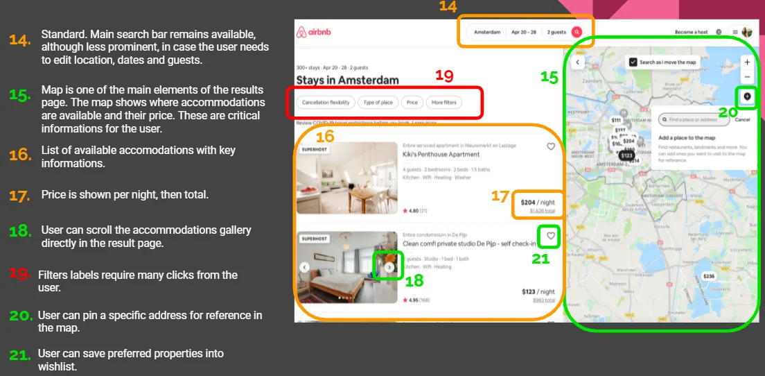
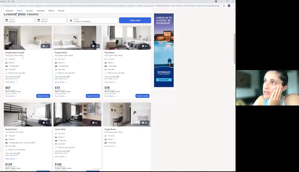
Explore and review four competitor websites to understand how they present information.
Key findings
Search Bar:
- Smart, intuitive, icons
- Calendars require multiple clicks
Results Page:
- Froze-in-page search bar for easy edits.
- Results are presented in a list
- Filters displayed upfront or via a button.
Hotel Page:
- Dominant visuals and images.
- Key features: maps and reviews.
- Display total price per stay, not per night.
Conclusion
Competitors' booking processes are much alike, so finding room for improvement needed other research methods.
Open the documentation
2. User research
Objectives
- Identify user goals and behaviors when booking hotels.
- Pinpoint pain points and desired features.
- Understand usage context, including devices and environments.
Methodology
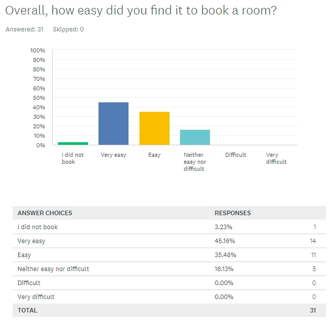
- Online Survey
- Audience: Regular hotel booking website users.
- Sample Size: 31 respondents.
- Format: Nine mixed-format questions on a single page.
- Usability Tests
- Conducted three tests with Expedia and Airbnb via Zoom.
- Observed and recorded user interactions, pain points, and preferences.
Key findings
Survey results
- Top Factors: Location, Reviews, Price.
- User Preferences: 65% prefer Booking.com for its user-friendly interface.
- Pain Points: Stressful marketing pop-ups.
- Desired Features: More filters, payment flexibility.
- Price Sensitivity: 35% prioritize lowest price.
Usability test insights
- Context: Various environments and devices.
- Behavior: Need for clear guidance and simplicity.
- Pain Points: Navigation difficulties, overwhelming information.
- Preferred Features: Intuitive interfaces, quick access to key info.
Conclusion
Putting the survey next to the usability tests gave me a clear picture of what users needed, and that picture drove the design decisions.
Open the documentation
3. Data Analysis
Objectives
- Define the problem using research data.
- Identify patterns and structure findings.
Methodology
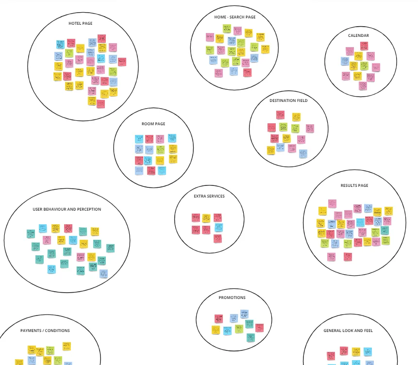
- Affinity Diagram (open Miro)
- Review and structure qualitative data.
- Highlight patterns and key issues.
- Gain diverse perspectives from a collaborative session.
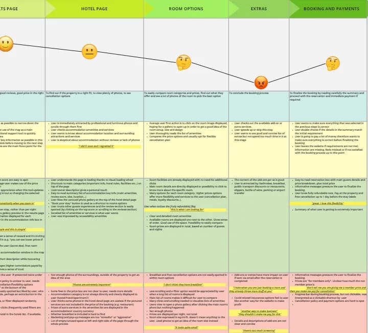
- Customer Journey Map (open Miro)
- Define steps, goals, and behaviors.
- Identify pain points and positive interactions.
- Visualize user emotions and experience.
Key findings
- "Search" and "Room options" pages need improvement.
- Users value clear visuals and images.
- "Add-Ons" stage is confusing with unclear pricing.
- "Booking and Payment" page causes uncertainty and average emotions.
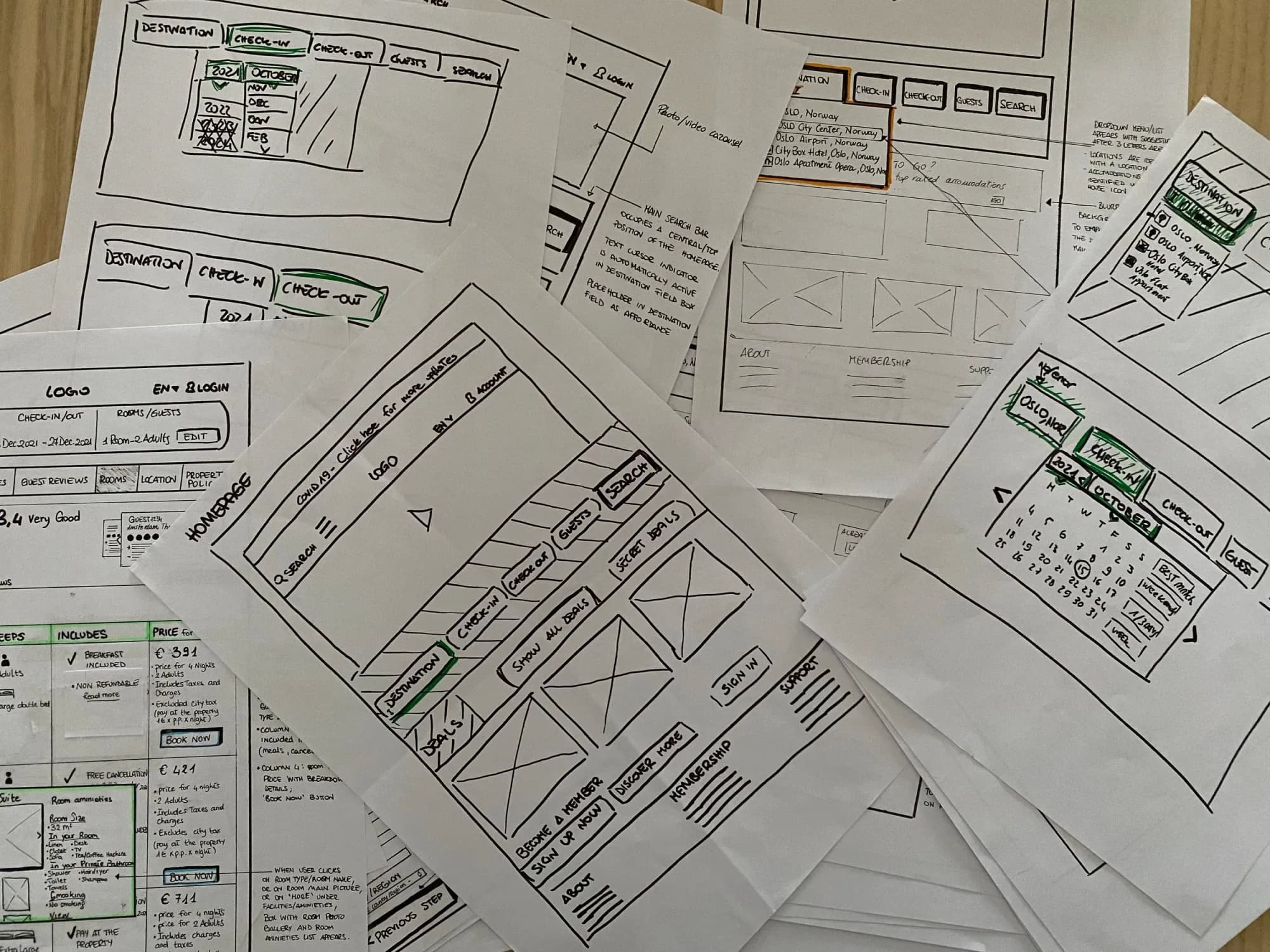
4. Wireframing and Prototyping
Objectives
- Fix the friction points the research had found.
- Utilize insights from affinity diagram and customer journey map.
Methods
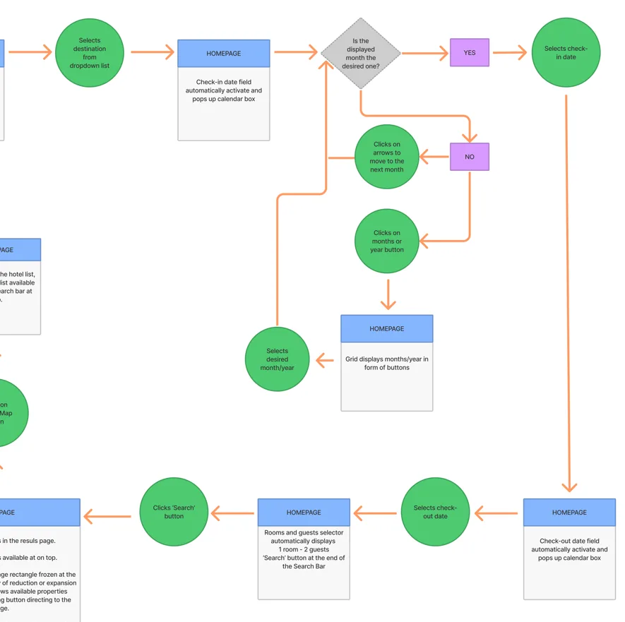
- Flow Diagram (open PDF)
- Purpose: Define high-level booking flow.
- Process: Started with sketches to map user journey from homepage to payment.
- Iterations: Refined paths based on user journey insights.
- Interaction Design (open PDF)
- Purpose: Sketch screens and states based on flow diagram.
- Approach: Used pen and paper for rapid iteration.
- Considerations: Integrated user goals and research findings into detailed designs.
Design solutions
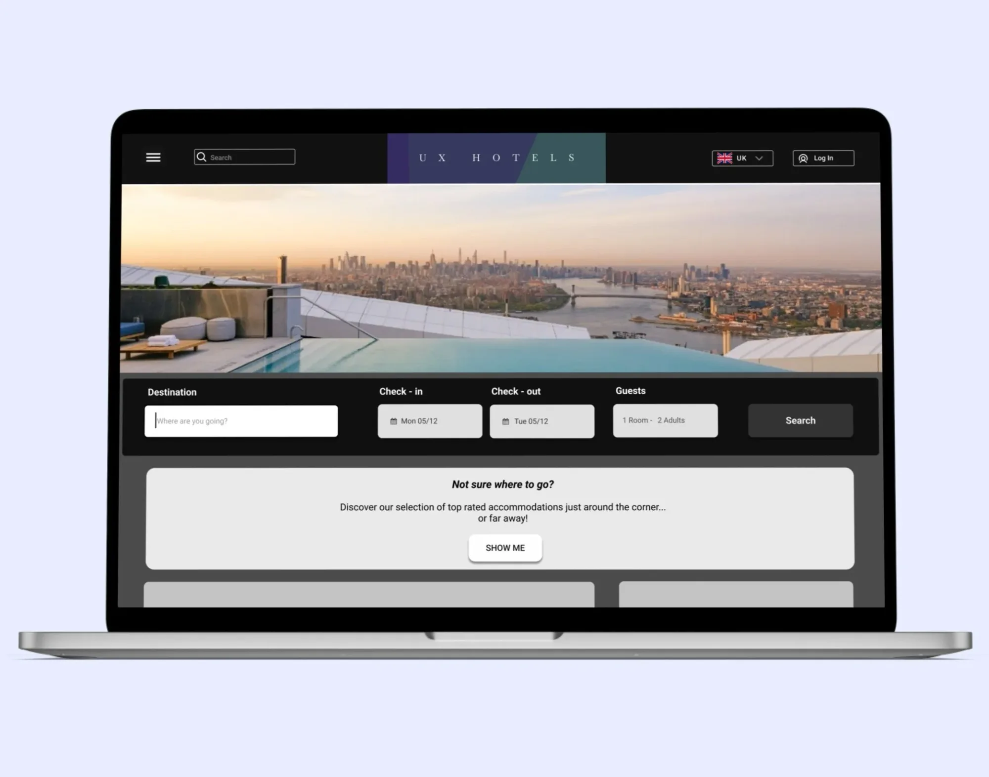
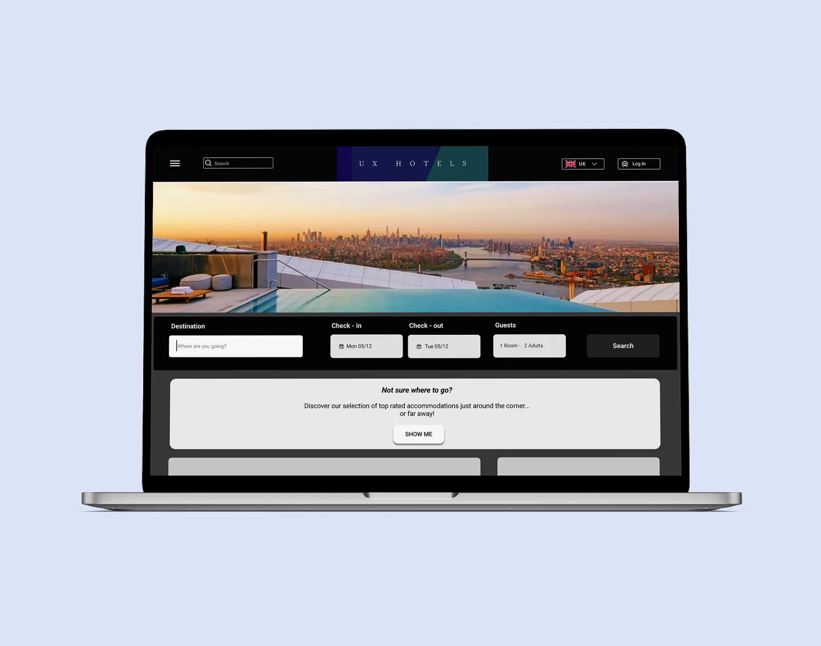
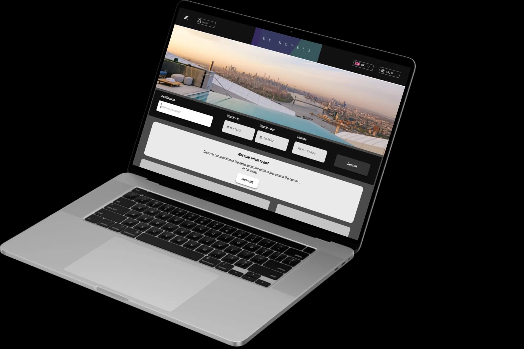
- Homepage: a clear search bar and a date picker that does not cost several clicks, which is what the benchmark found on every competitor calendar.
- Results Page: an interactive map, since location was one of the three factors the survey put at the top, plus loading feedback while results come in.
- Hotel Page: a map of nearby attractions and a grid view for comparing rooms. The journey map named "Room options" as one of the two weakest pages.
- Check-out Process: a step-by-step status bar, a simpler add-ons selection and a clear booking summary. The journey map showed add-on pricing was unclear and the booking and payment page left people uncertain.
5. Iterative Design
Objectives
- Create a medium-fidelity prototype to test flow, layouts, and interactions.
- Revise it on user feedback.
Key improvements
- Made the map icon bigger so people could find it.
- Replaced the date dropdown with a clickable button.
- Simplified the add-on descriptions and moved them to hover.
User feedback
- Users liked the mid-sized map on the Results page.
- Positive reception to changing and comparing cancellation/payment options.
Prototype details
Open the prototype in Figma
- Booking Scenario: Oslo, Norway, 15-19 October 2022 with Airport Pick-up/Drop-off.
- Interactions: Interactive elements throughout from search to payment.
Challenges and self-reflection
Building the prototype taught me how much detail and usability work sits inside a Figma file.
Handover
Open the annotated wireframes in Figma
Objectives
- Create detailed wireframes with rules, controls, and feedback for each screen in the hotel booking process.
- Ensure developers have clear instructions to accurately implement the design.
Process
I drew the full wireframe set after the research, analysis and design phases, so development had something to follow.
Key points
- Clarity: Precise annotations for each screen state.
- Detail: Ensured all design elements were clearly defined for implementation.
Reflection
Writing the hand-over showed me how much of UX design is collaboration, and how much weight the documentation carries once someone else has to build the thing.