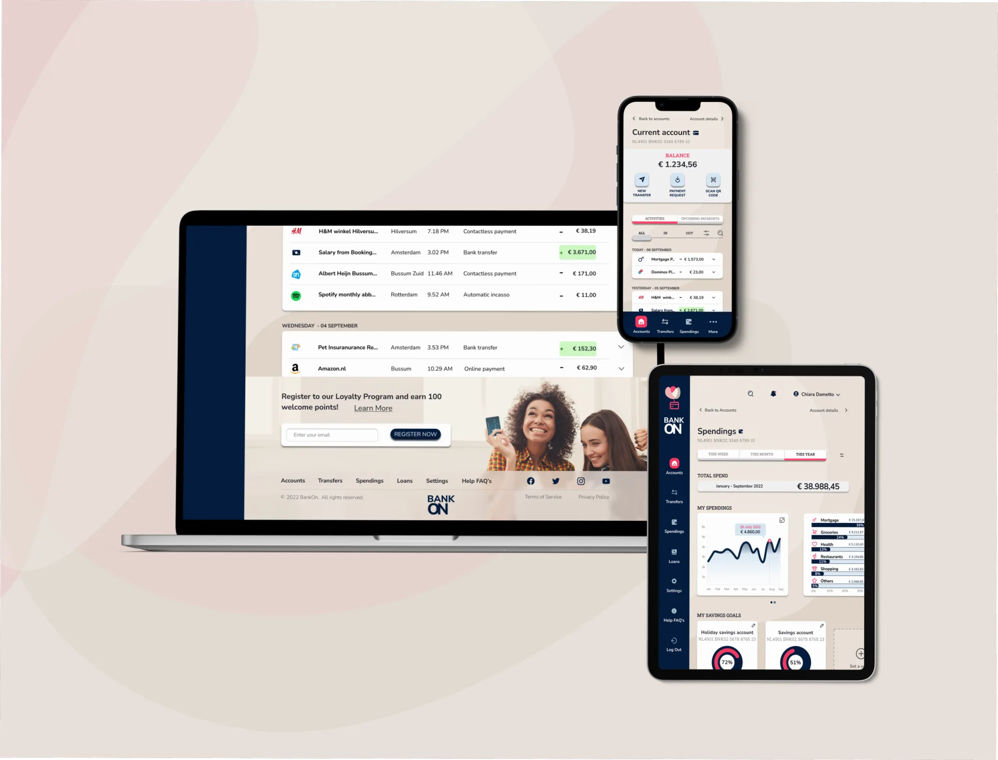
User Interface design for a responsive, personal banking web app
Role
UX Designer
Timebound
3 months (part time)
Tools
Pen & Paper, Figma
The problem
The project involvesdesigning the UI for a challenger brand in the financial world. They want a fresh web app for personal banking that could stand out.
Most banking apps are kinda dull, old-looking and not very user-friendly these days. They needed something more modern and intuitive without feeling outdated.
Task
Create a UI that worked smoothly on phones, tablets, and desktops for a fintech company wanting to shake up personal banking.
Technical requirements
Full UI design
Responsiveness
Design Goals
The UI had to match their brand principles:
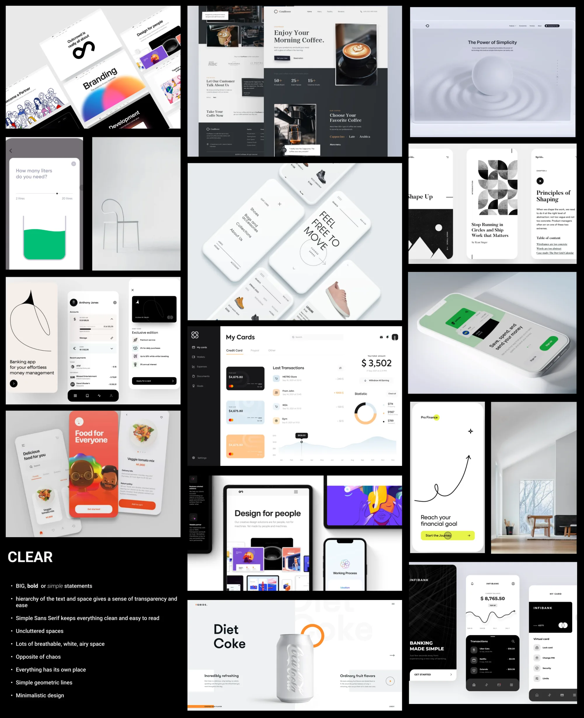
Clear: Keep things simple and logical since it's about people's money.
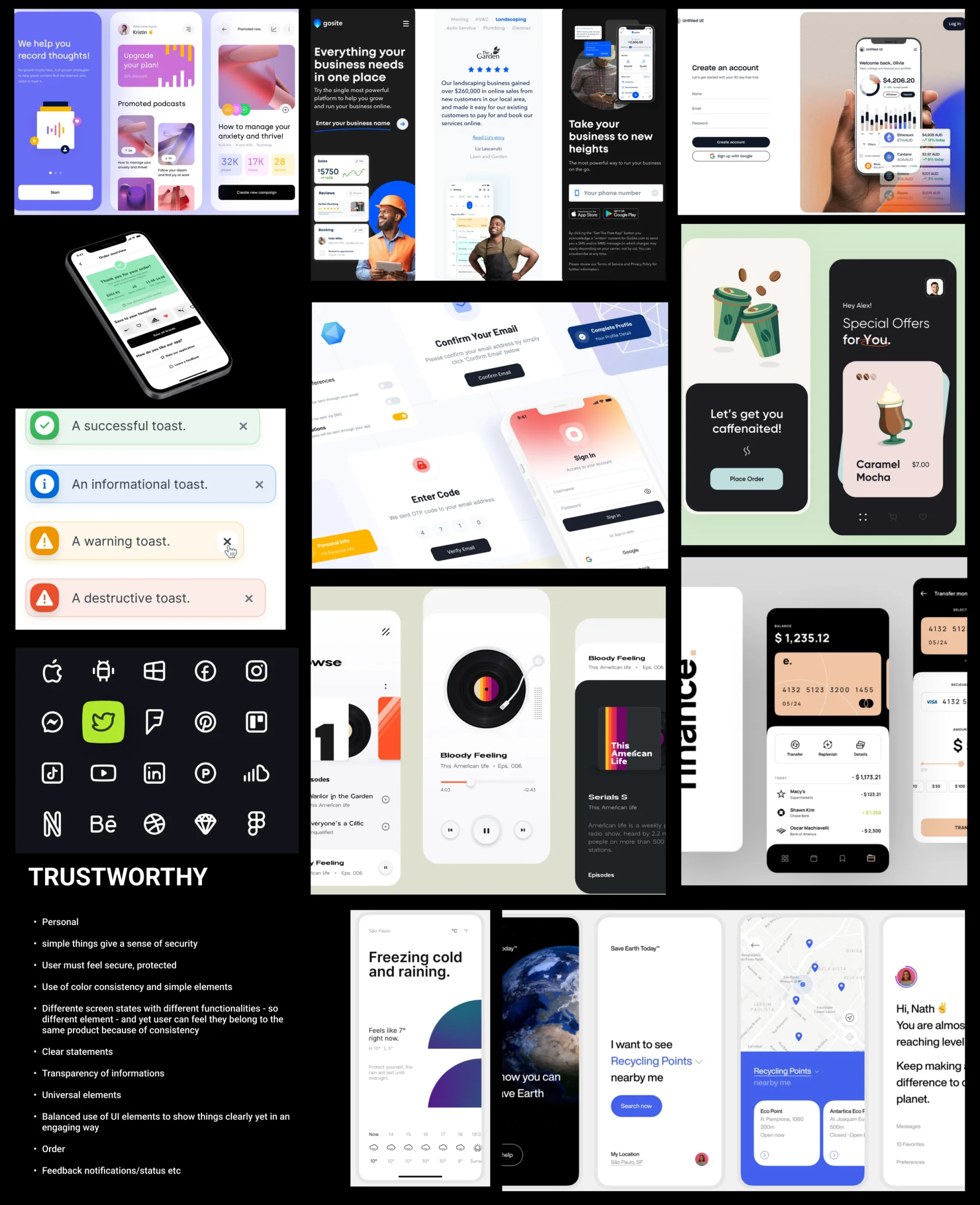
Trustworthy: Make users feel safe and secure.
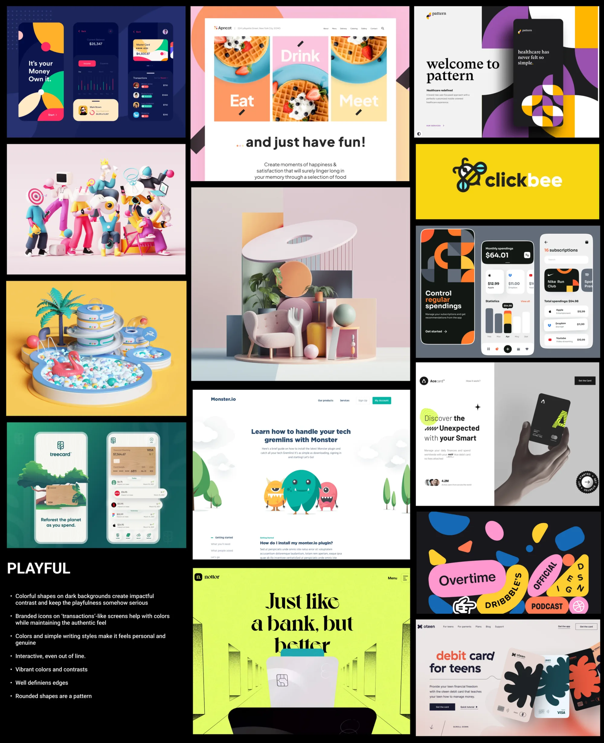
Playful: It should be easy to use but still have a bit of fun without confusing anyone.
My approach
I didn't have much experience in visual design, so this was a challenge. I started by looking at other cool fintech apps and general design ideas to get inspired.
This project really pushed me to learn about designing for different devices and how to balance style with usability, especially in banking, where trust and clarity come first.
1. Discover & Mood Boards
I started with competitor research and pulled references from Dribbble, Pinterest and Behance.
Playful: I looked up for products that nailed that playful vibe, whether through vibrant colors, quirky animations, or unique shapes.
Trustworthy: I also looked into companies that transpire trustworthiness in their product design: solid presentations that make users feel secure and confident.
Clear: For clarity, I sought out examples that ace white space and clean typography to ensure designs are user-friendly. When dealing with people's finances, simplicity is key.
I expanded my mood boards to include:
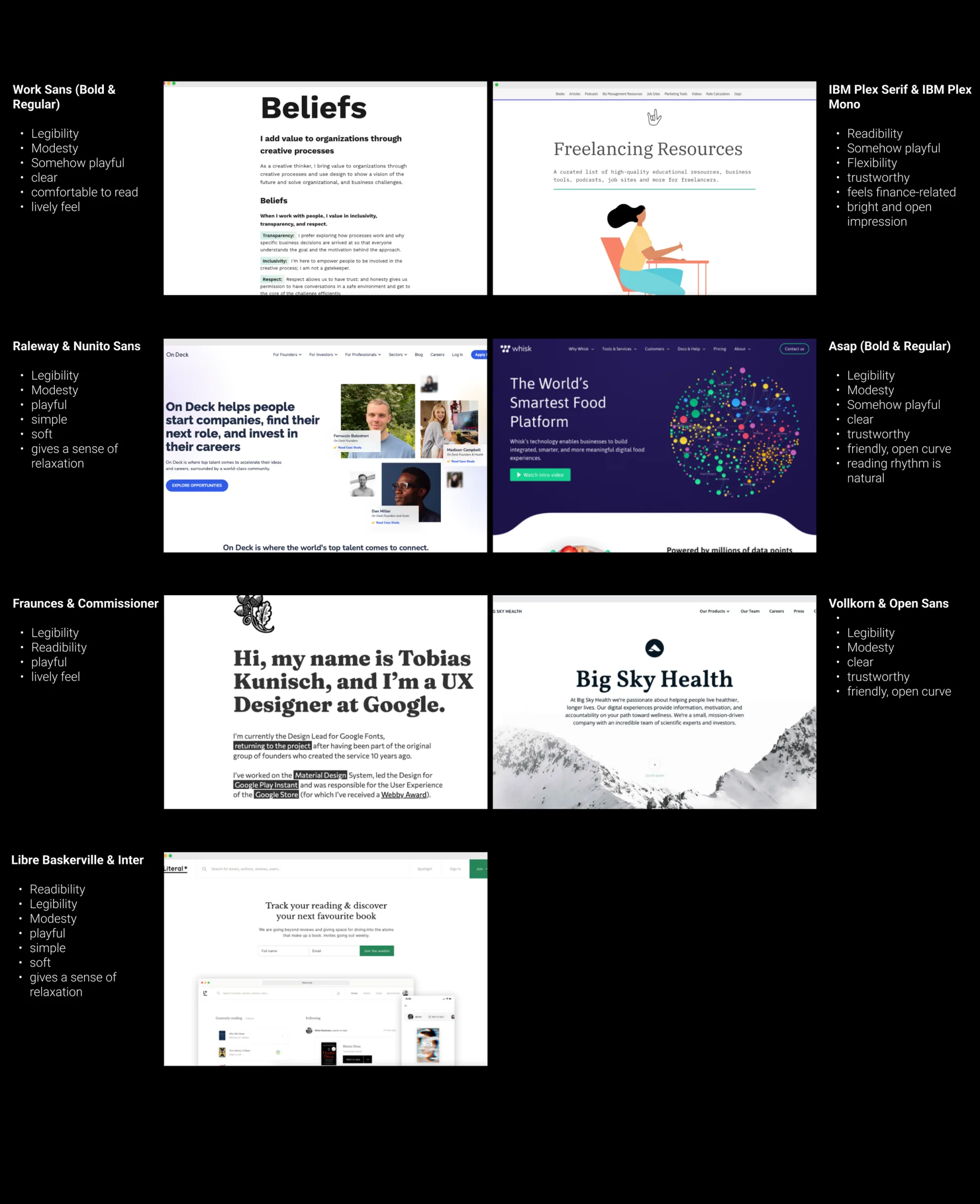
typography
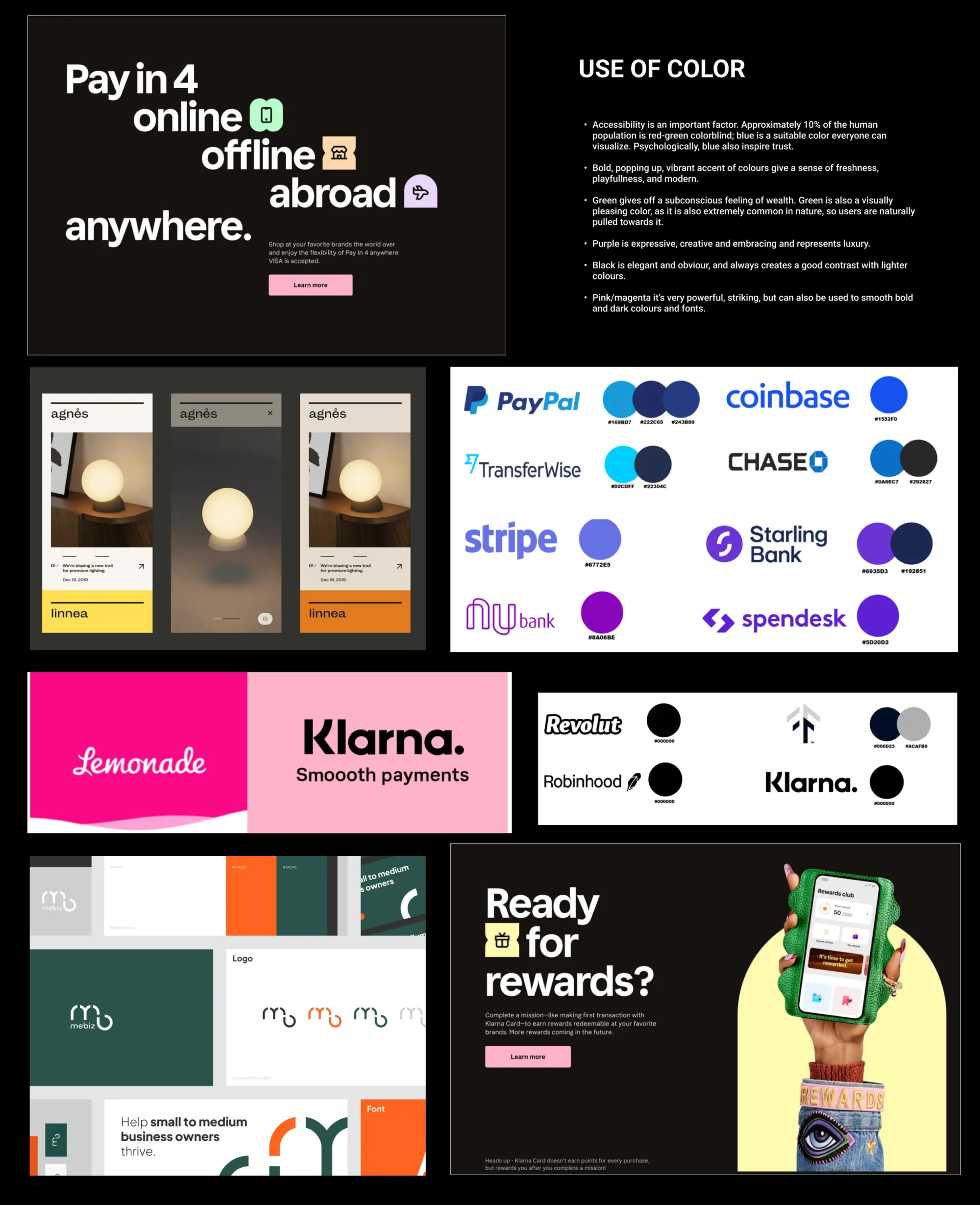
color palettes
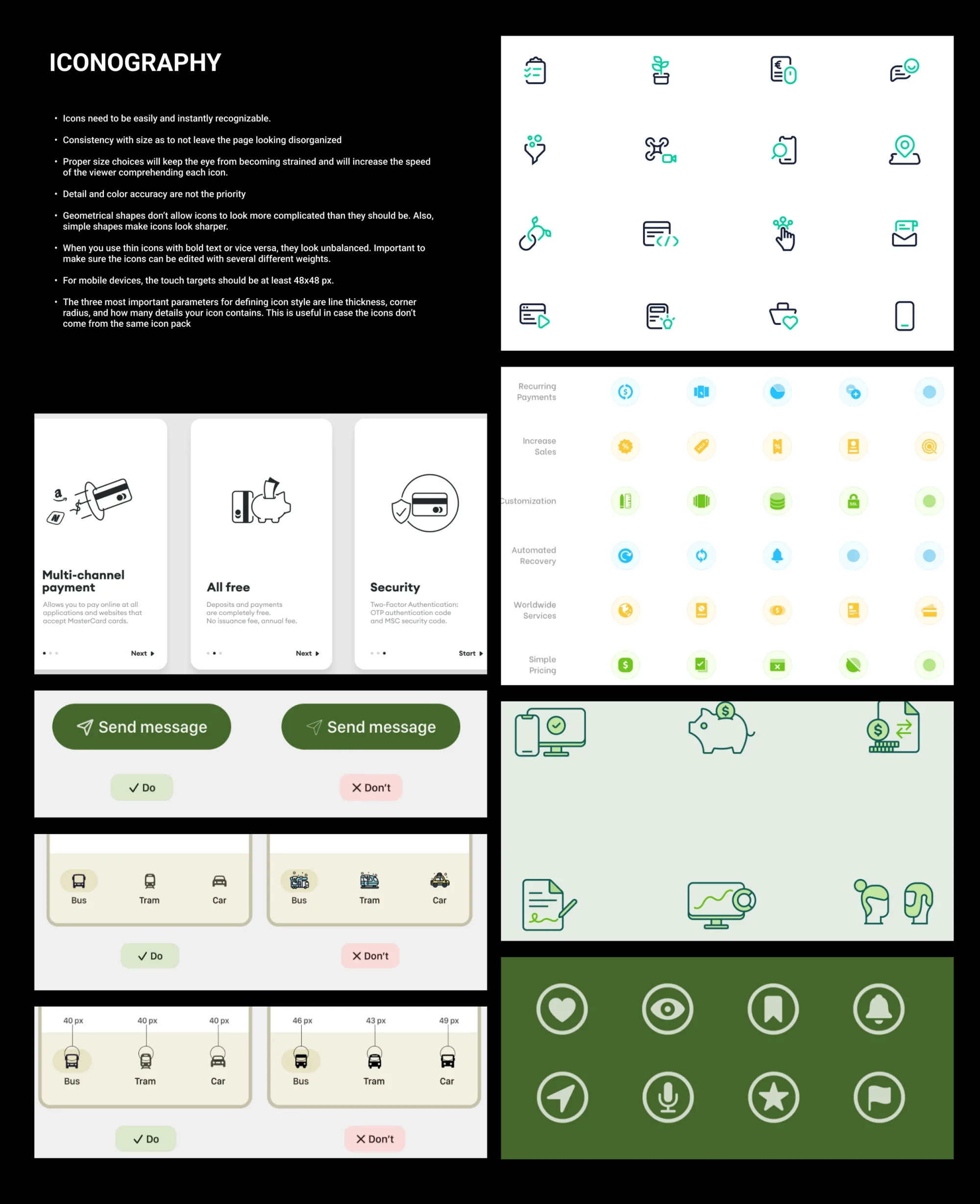
icon styles.
That turned the brand principles into a clear Design Intent, which I could then check each design choice against.
As I gathered inspiration, I began exploring design ideas, focusing on color palette, fonts, and iconography to reflect the brand's values.
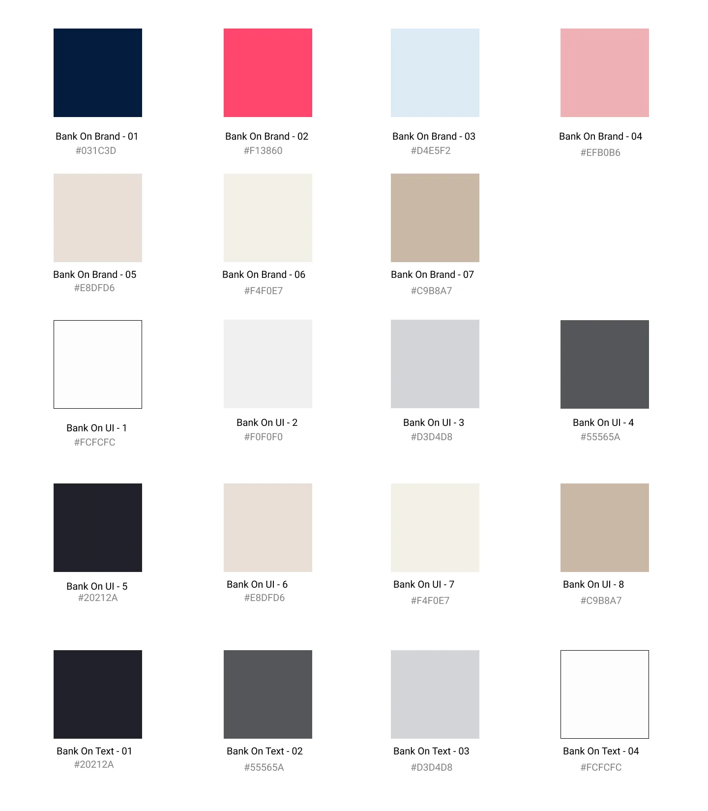
COLOUR PALETTE I built a palette for playfulness, clarity and trust, then ran legibility tests on it.
Blue Tones: Convey trust and clarity with dark blue, gray, and white for strong contrast.
Magenta: Adds boldness and playfulness, used sparingly to avoid issues for color vision deficiency.
Sand: Introduces peace and elegance, added later for breathability and lightness.
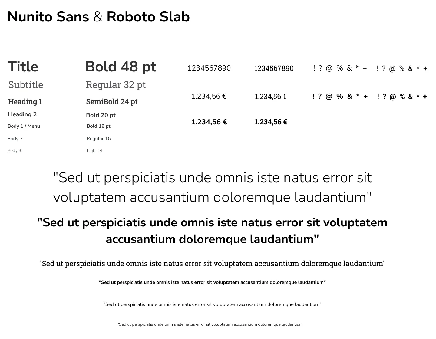
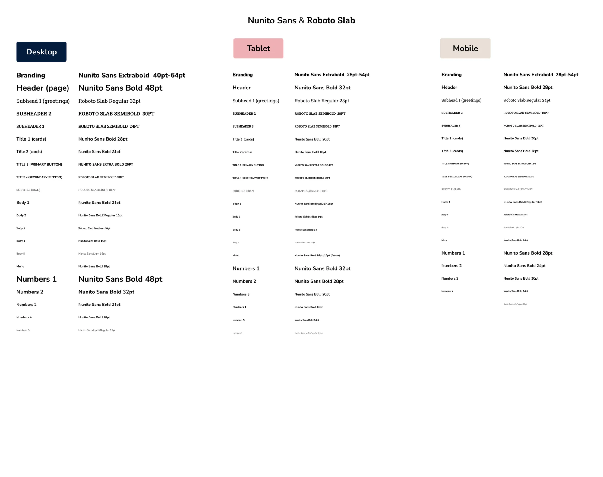
TYPOGRAPHIC SCALE I chose two fonts for simplicity and readability, organizing variations per device.
Nunito Sans: Balanced, readable, trustworthy, and flexible for a playful look.
Roboto Slab: Geometric, friendly, and clear, with a sense of trustworthiness.
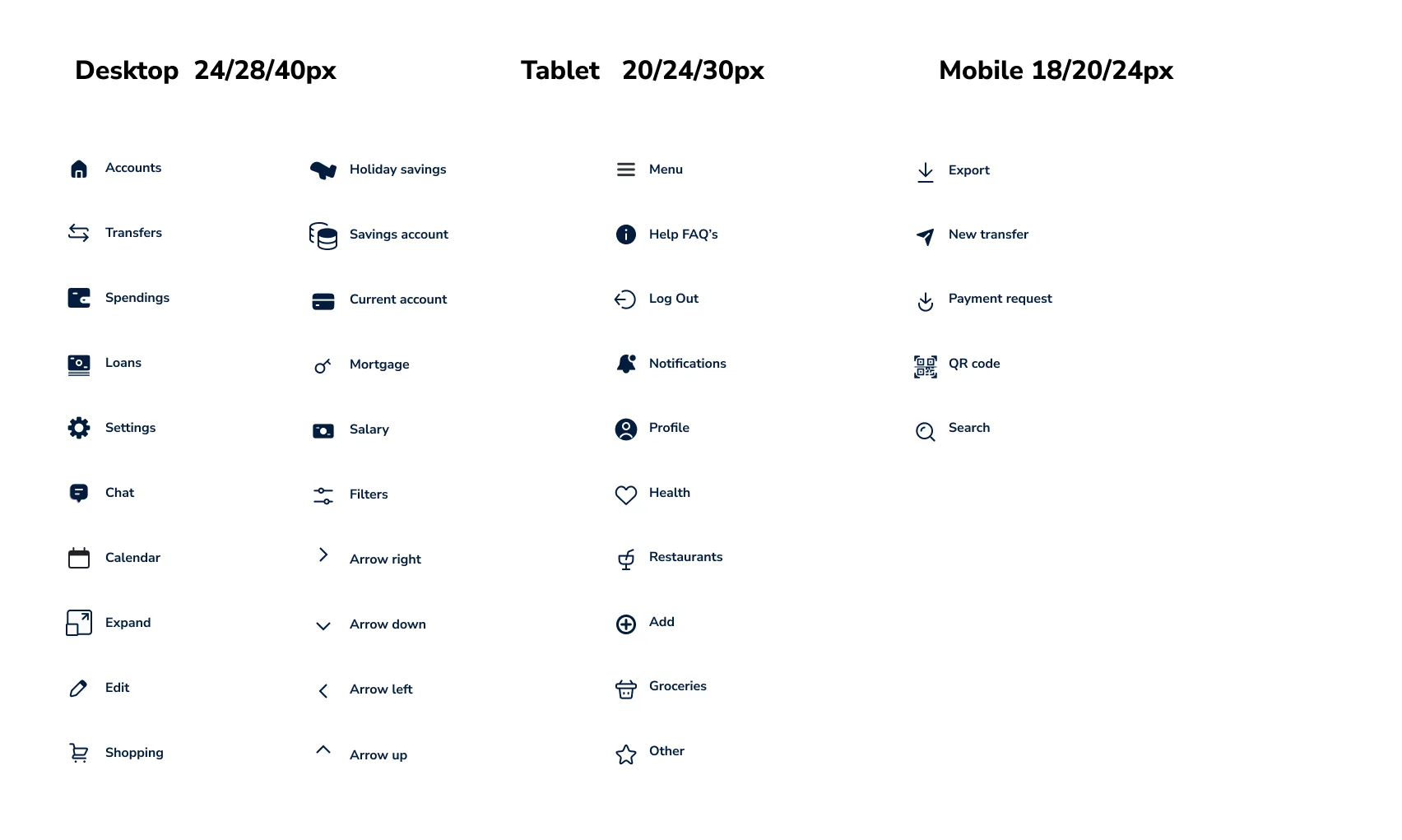
ICONOGRAPHY I selected simple, outlined icons with consistent shapes and rounded corners to match the brand's identity of simplicity, clarity, and fun.
The palette: blue for trust and clarity, magenta used sparingly, sand added later for lightness
Nunito Sans and Roboto Slab, with variations organised per device
Heading and body variations across the breakpoints
The icon set: one stroke weight, rounded corners throughout
Starting off with sketches from zero wasn't easy, but my main goal was to brainstorm how information should be displayed across various screens. I sought feedback from my mentors early and often, enabling me to iterate quickly and improve the design with each cycle.
3. Sketches and Iteration
Throughout the process, I identified structural and visual challenges that helped me refine my focus:
Make the design carry the brand's personality.
Apply Gestalt principles so the screens read without effort.
Stick to layout fundamentals: a balanced, ordered interface.
Use colour and shape to communicate, not to decorate.
Spend white space so the page does not clutter.
Guide the eye with font style and size.
Strip out UI elements that are not doing work.
Round and soften shapes so the interface feels approachable.
with self-reflection based on my own observations of possible improvements and my mentor's feedback.
Iteration 1
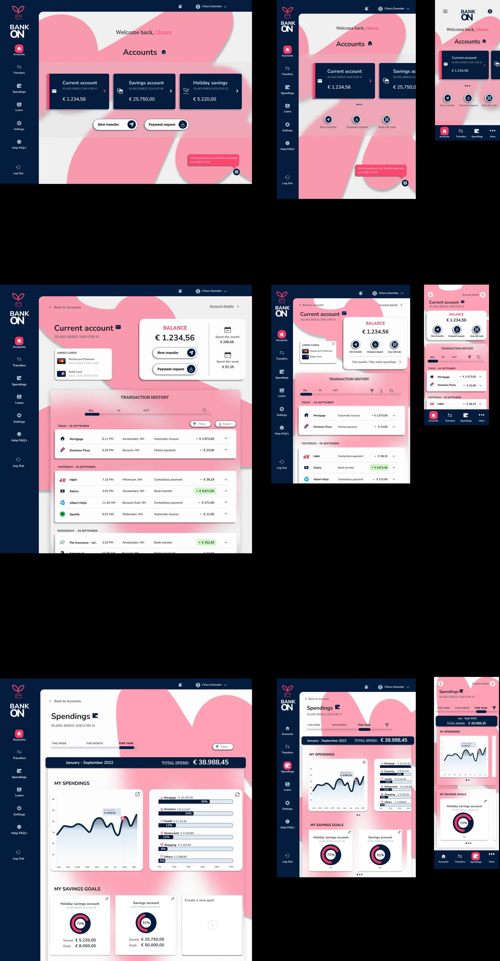
At this stage, I focused on experimenting and applying my learnings to the design. I incorporated circles to add playful visual elements.
Possible improvements
Scalability and Functionality: As the design scales down, especially in the mobile version, the same circle element is used as a button. Users might question if there is a gesture attached to the circles in other versions as well.
Color Scheme Consistency: Issues with the color scheme and lack of consistency in styles of the active state in the navigation bar.
Drop Shadows: Inconsistency with the drop shadows of elements.
Background Competing with Content: The dark blue background competes with the important content of the page.
Iteration 2
I addressed the improvement points from the previous design and focused on refining the elements.
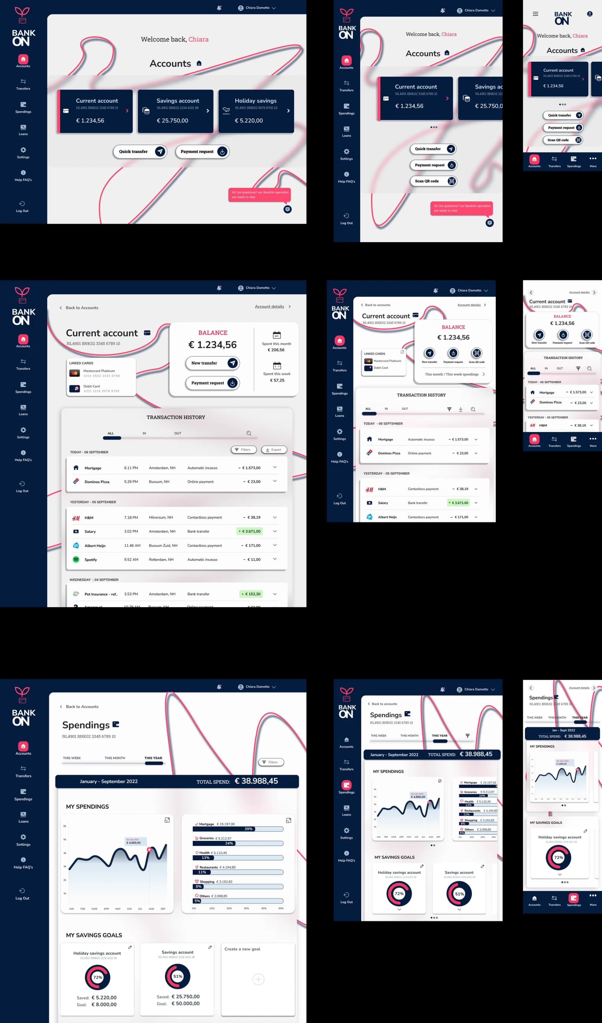
For the next three iterations, I experimented with different background elements and colors to determine what worked best. I also explored various button styles.
Possible improvements
Background Elements: While the playful background element works well in the mobile version, the stroke thickness becomes too visually prominent on larger screens, giving a "graffiti" vibe. This is not ideal for a banking product.
Iteration 3
In this phase, I realized a few critical points for further refinement:
Separation of Information: It became evident that it was hard to focus on important information. I needed to add more layers to separate information from the background, indicating that my current approach wasn't effective.
Icon Alignment: Some icons in the 'My Spendings' graph were not aligned and vertically distributed properly, needing further adjustment.
Iteration 4
Scalability issues: these lines element might represent a challenge for developers when coding. They might end up aligning differently in different devices, and might crash with texts or other elements.
Once again, although it brings a playful touch in the mobile version, the stroke doesn't work. Even in the Spending's page, it could be removed altogether. it doesn't add anything
Iteration 5
Fixed the improvements point from previous design.
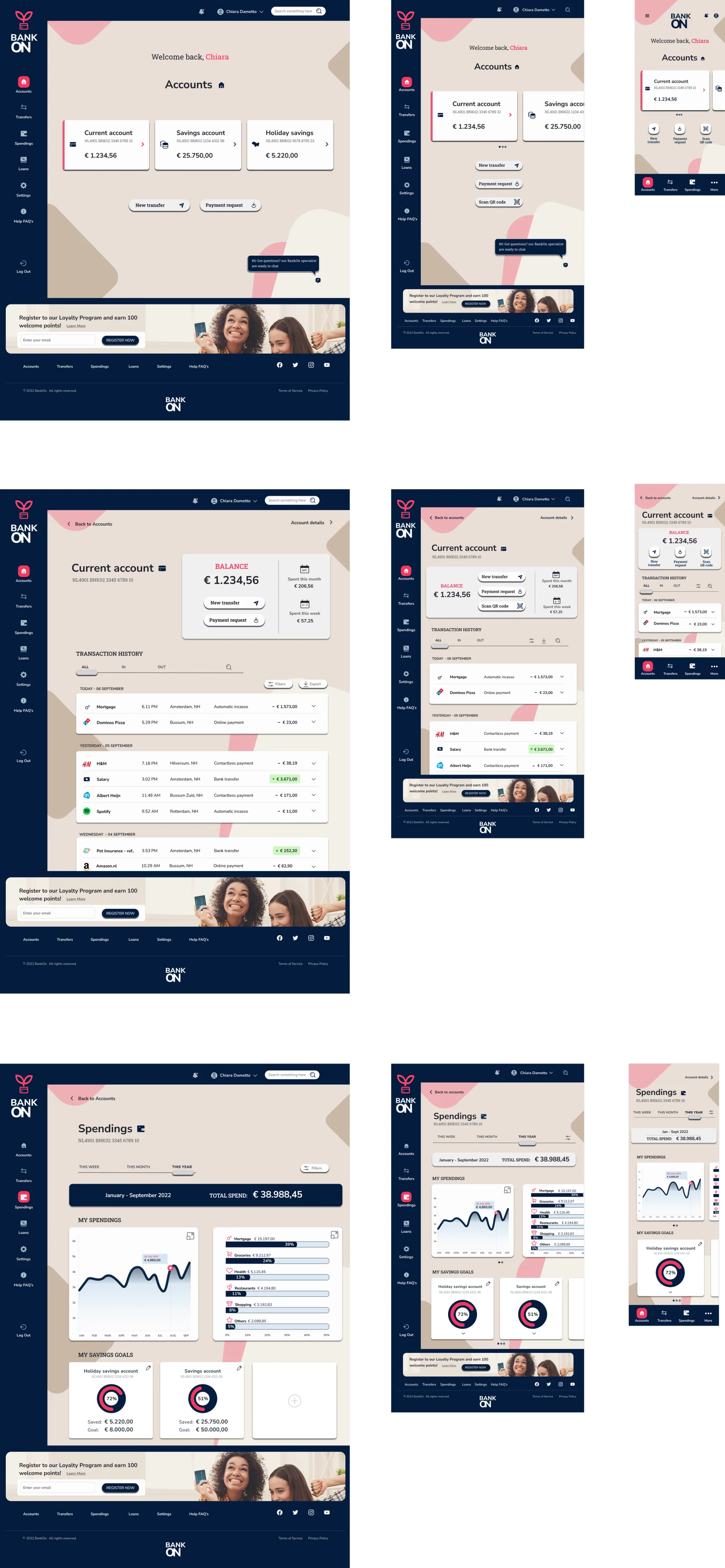
Here I am trying different colors and shapes to find a sweet spot. Simple.
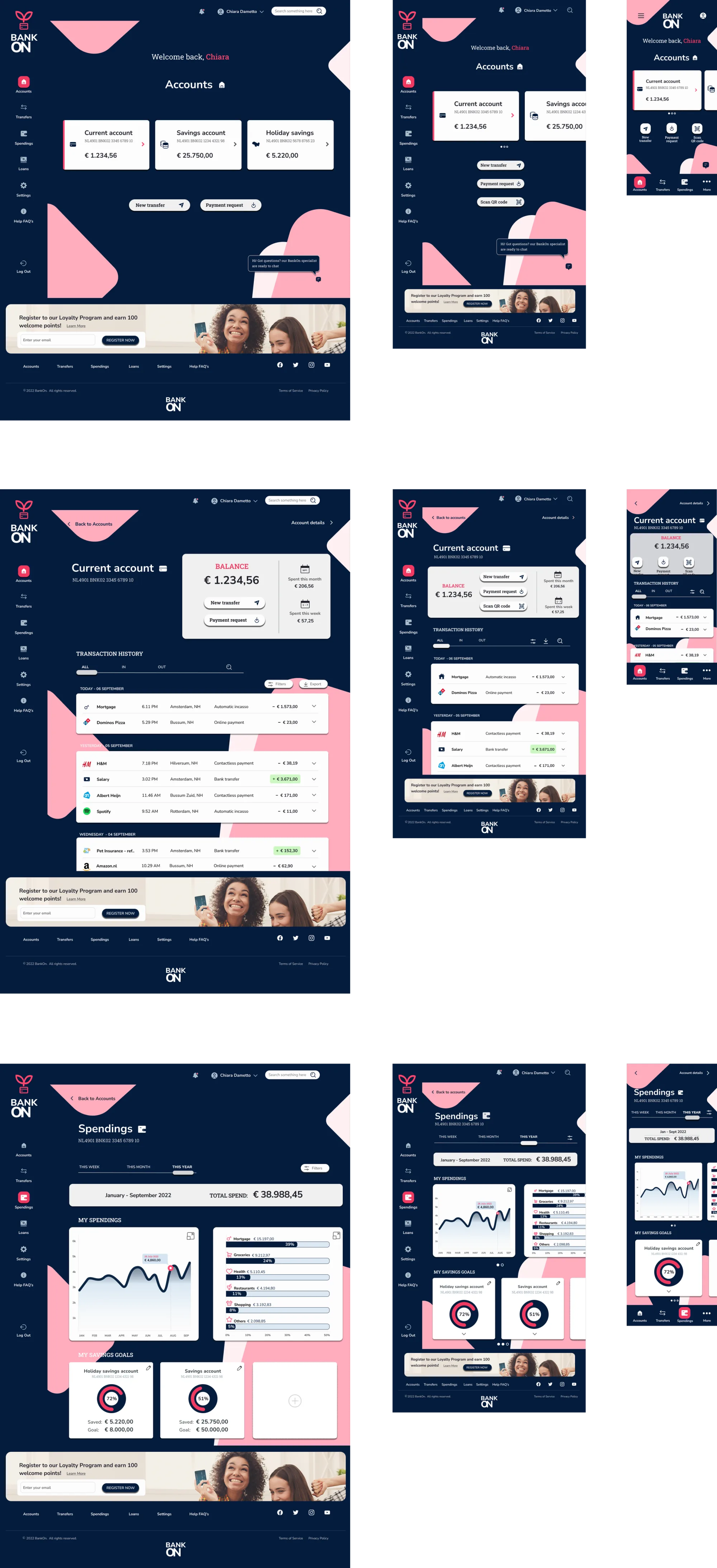
'credit-card' shaped elements are added to the dark blue background for playfulness.
Possible improvements
dark tones make it difficult to visually separate elements from the navigation bar and seems heavy
dark background almost shuts off the playfulness
Iteration 6
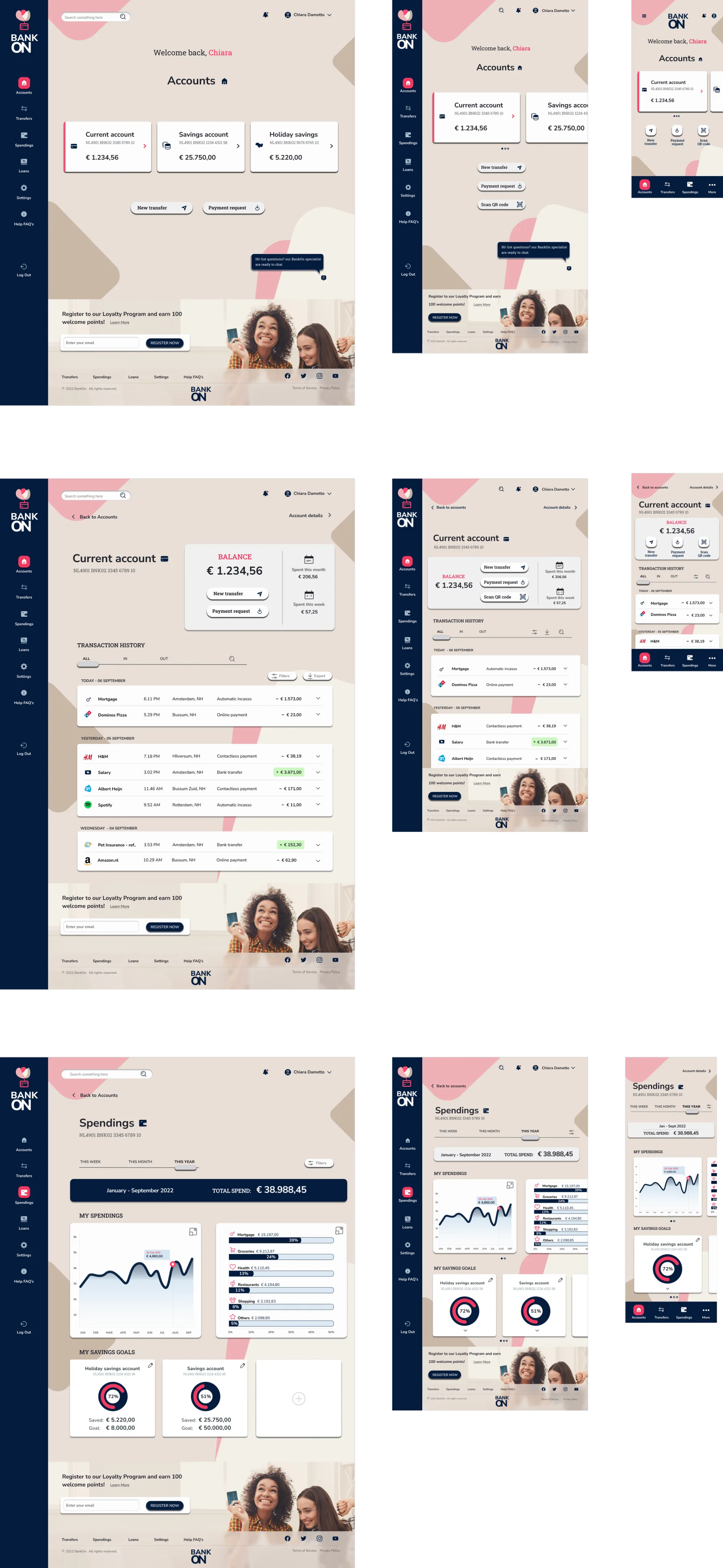
At this point, I decided to experiment with totally new colors. My color palette is evolving.
The background soft-sandy color is giving more of a airy feeling, the elements are finally popping up and taking the space they are supposed to in a hierarchical system.
Possible improvements
The footer is still taking some attention away from the rest of the page. due to dark background. perhaps it would work best if it would blend in with the rest
The top navigation bar in the same color of the side navigation bar and the footer, contributes to 'boxing' the page, possibly too much. It gives a sense of outdated website.
Iteration 7
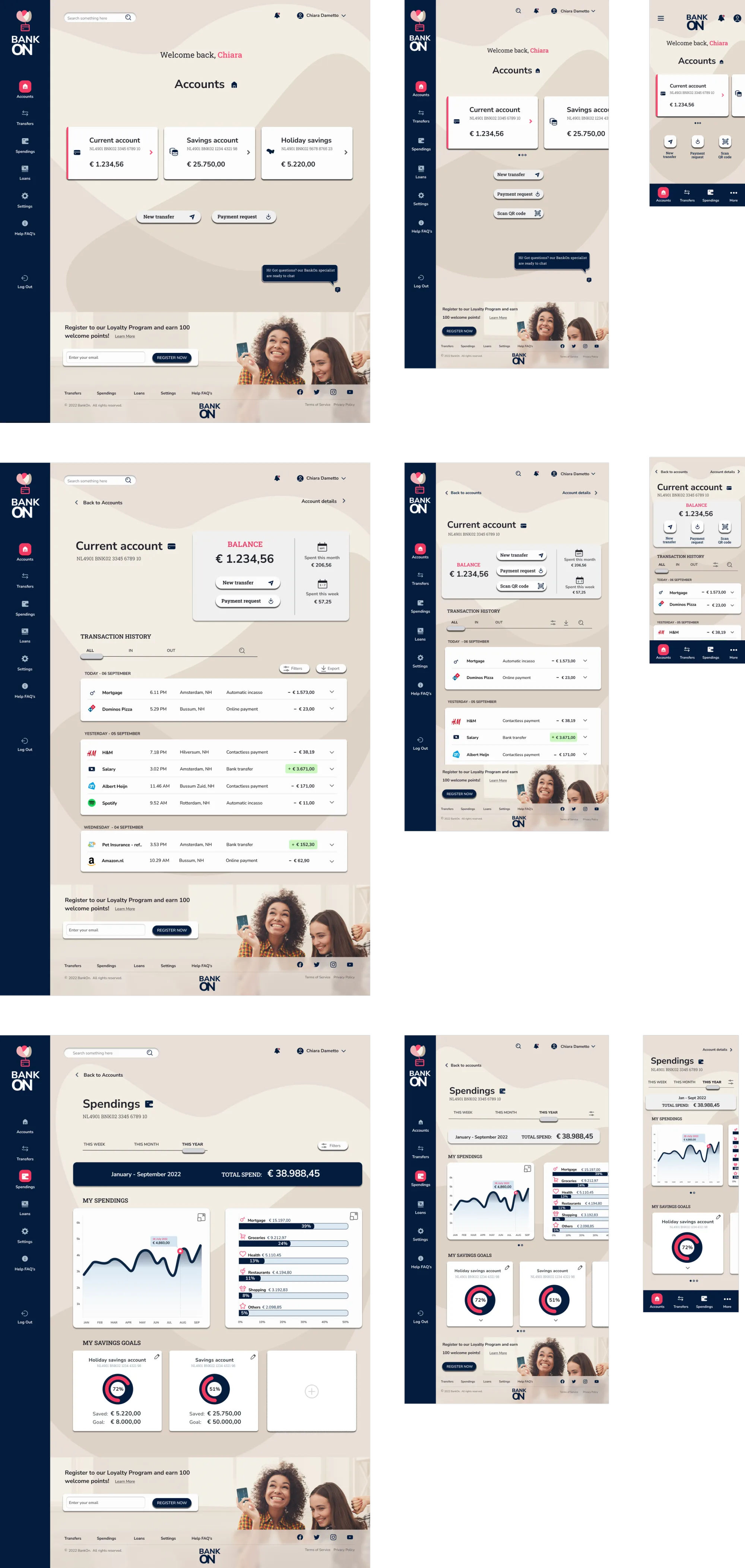
In this iteration, I worked on improving the previously mentioned points and removed the dark blue background altogether from the top navigation bar and the footer.
I also extended the side navigation bar component to the bottom of the page. so the content of the footer would better align with the rest of the page.
Possible improvements
The shapes in the background are working well in the mobile version, but still taking away attention to more important content. There is space for playing around a bit and find a balanced approach to bring on playfulness while not compromising the 'clear' and 'trustworthy" principles
Iteration 8
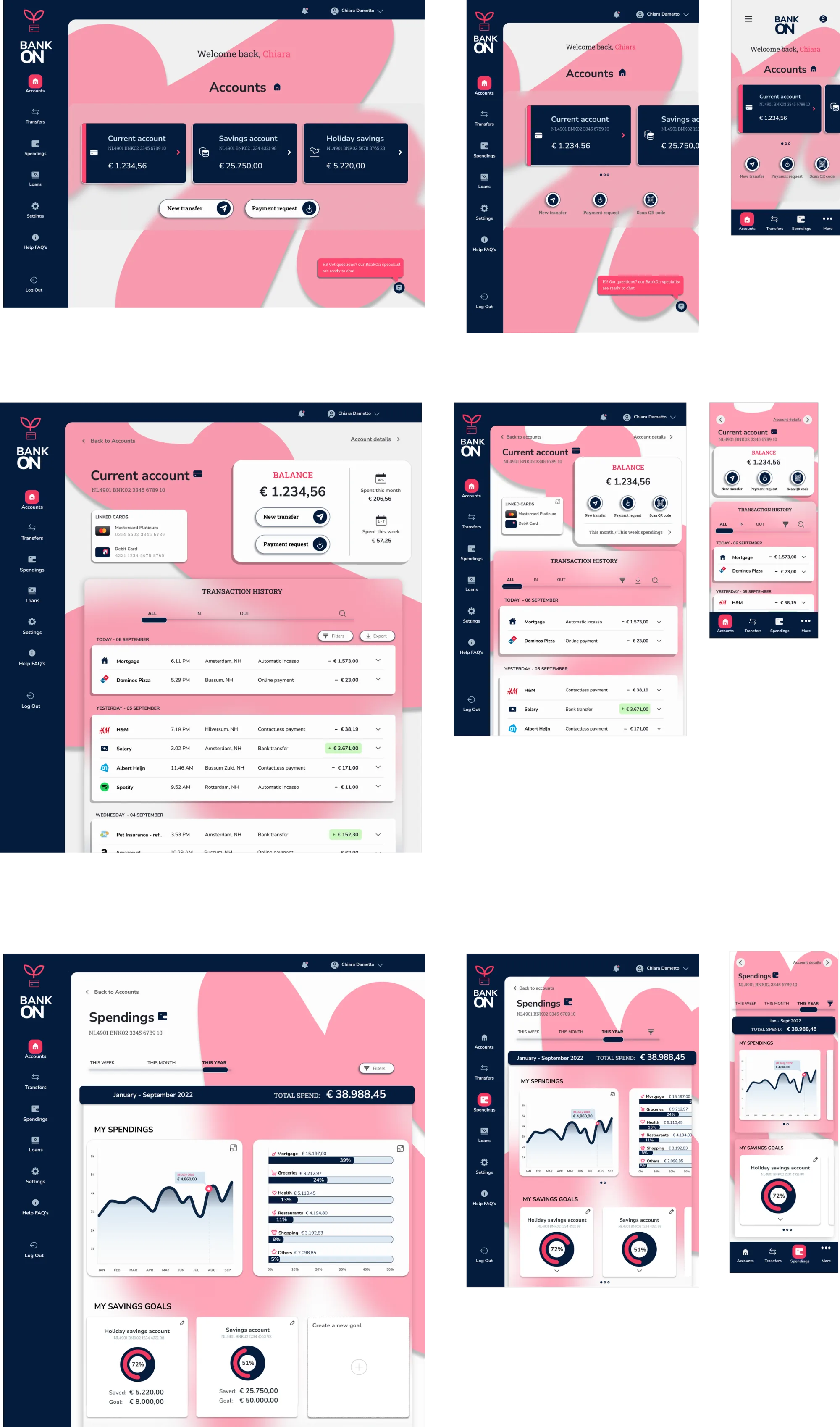
After exploring inspirations online and playing around on Figma with shapes of different kind, I figured that a more elegant approach would be soften up and neutralize the background colors and shapes to blend with the rest.
The playfulness still transpires from the soft and bubbling lines of the background leaves, which are inspired by the brand logo (self designed colorful flower blossoming from a credit card which recalls the iconography used in the rest of the page)
Possible improvements
The background shapes are maybe still too defined and "boxed' inside the page frame
Iteration 9
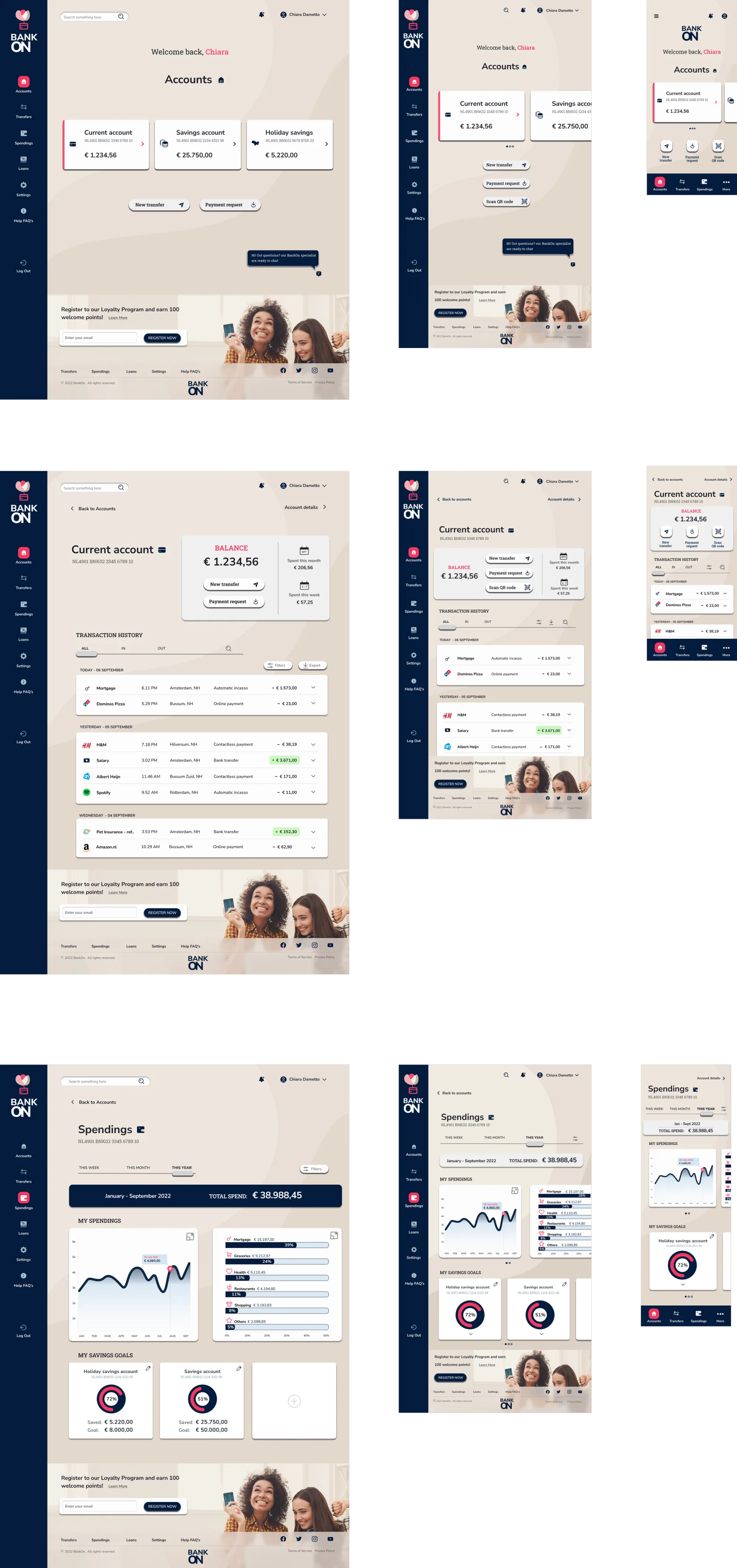
In the last iteration. I designed the background shapes to extend out of the frame, to give a more fluid feeling. while keeping the connection to the playful. colorful brand logo of BANK ON.
At this stage I worked on the details: alignment against the columns and the 8px grid in Figma, consistent sizes for buttons, boxes, fields and states, and a revisited typographic scale that gives the key elements their weight.
I also made sure all elements would be grouped, ordered from top to bottom and labeled with appropriate names in the pages column in Figma, ready to be handed over to developers and easy to navigate for potential colleagues collaborating to the project.
Possible improvements
Focus on the smallest details
Explore other elements that could benefit from a touch of magenta which is used, at this stage, as one of the main source of visual playfulness
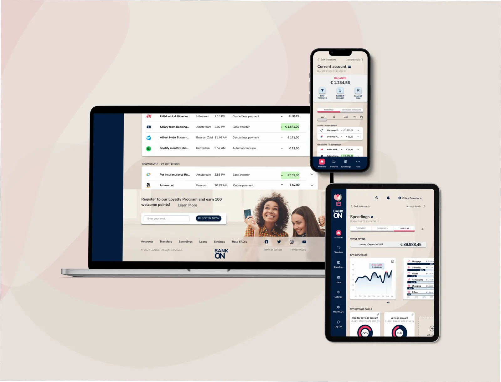
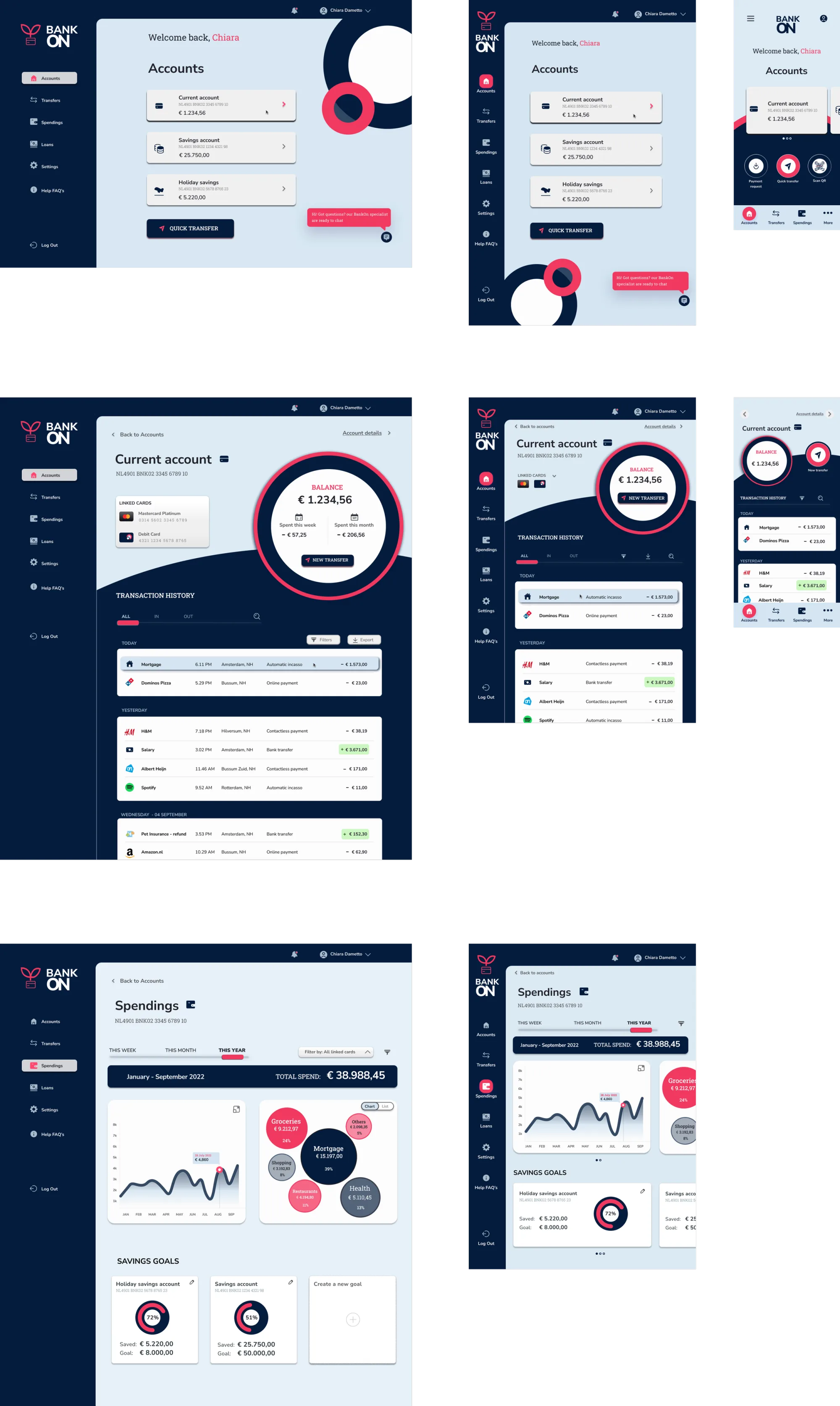
Final User Interface
Nine iterations converged on one decision: let the background carry the playfulness, and leave the content plane to do the clear and trustworthy work. The dark blue came off the top navigation bar and the footer at iteration 7. At 8 the background shapes were softened into leaves drawn from the brand logo, and at 9 they run past the frame. The three brand principles land on the layout as:
Playful, Clear, Trustworthy
My Challenges
My Learnings
BankON is my very-first UI case study.
After getting my Professional Diploma in UX Design last year, it felt natural to explore more design disciplines.
Since this was an academic project, there are no real metrics or results to show. Instead, I will share what I've learned.
Diving into UI Design
The skills I picked up during the UX course came in handy, especially when it came to user-centric thinking. While there are always details I could have improved, the learning curve was steep, and I'm pretty proud of what I pulled off.
Proud Moments
What I'm most proud of is how the brand principles of playfulness, trustworthiness and clarity shine through in my design. Bringing these values together in a single design wasn't easy, but I think the colors, shapes, and spaces I used really nailed it. The research phase, with all the mood boards and style references, did the groundwork, but the fun started when I began sketching. Playing around with shapes, fonts, and colors, and getting feedback was exciting. Even when things didn't work out, it pushed me to ask for feedback and dive deeper into new ideas, which helped me improve each time.
Areas for Improvement
The biggest challenge I faced was my initial lack of structure. I was so eager to start sketching and playing with colors that I didn't lay down a solid foundation. This led to issues later on, and I realized too late that I should have focused more on consistency from the start. Simple things like using layout grids and columns would have saved me a lot of time. In the final stages, I had to spend a lot of time fixing details that didn't fit into the layout anymore. This project taught me the hard way that UI design isn't just about pretty colors and cool fonts. It is about creating a thoughtful and organized design from the ground up.