← All projects
Verto.sh

Rebrand & UX for an Open-Source collaboration platform

Role
UX/UI Designer
Timebound
3 months
Tools
Figma, Miro, Online interviews, Google Forms

Context & unknowns

A new owner took over the unused and outdated site and asked for "modern, playful, reliable."

I walked in not knowing:

  1. Who really used it? Was it just first-timers or any seasoned folks?
  2. What caused users to leave? Old visuals, no filters, or both?
  3. Can we update the look quickly, then improve the UX later without rebuilding everything?
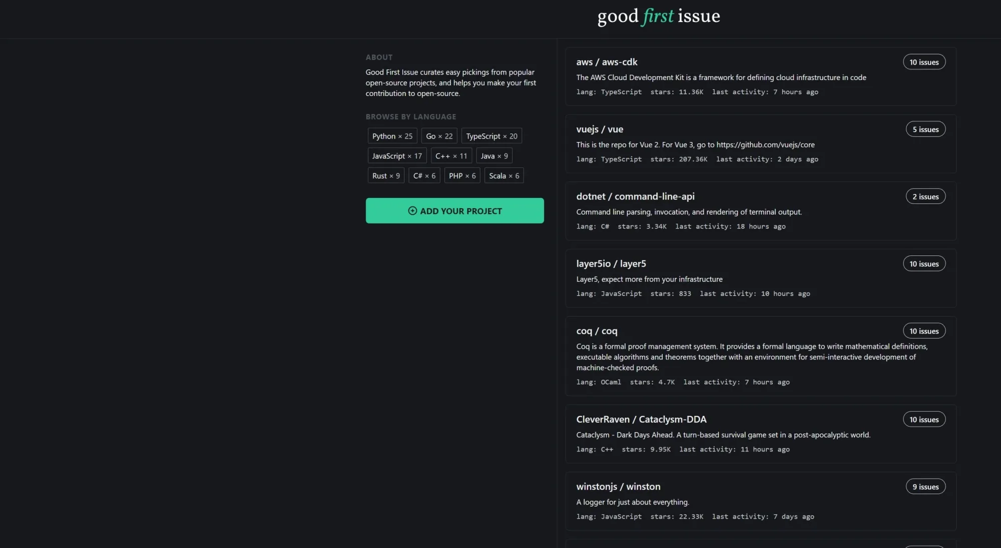
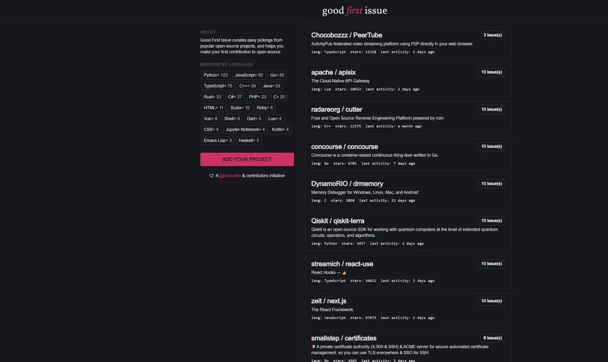
The Good First Issue site before the redesign: a dark page with an About blurb and language chips on the left and a plain list of repository cards on the right.
The initial design status

From gray areas to clear moves

Gray areas

  • 78% of clicks were on the left half of the page (NN/g study)
  • Users asked for "language" and "difficulty" filters
  • Brand felt "too student" for senior devs
  • Extra challenge: the owner decided on a bold move and changed the platform name

What I did with it

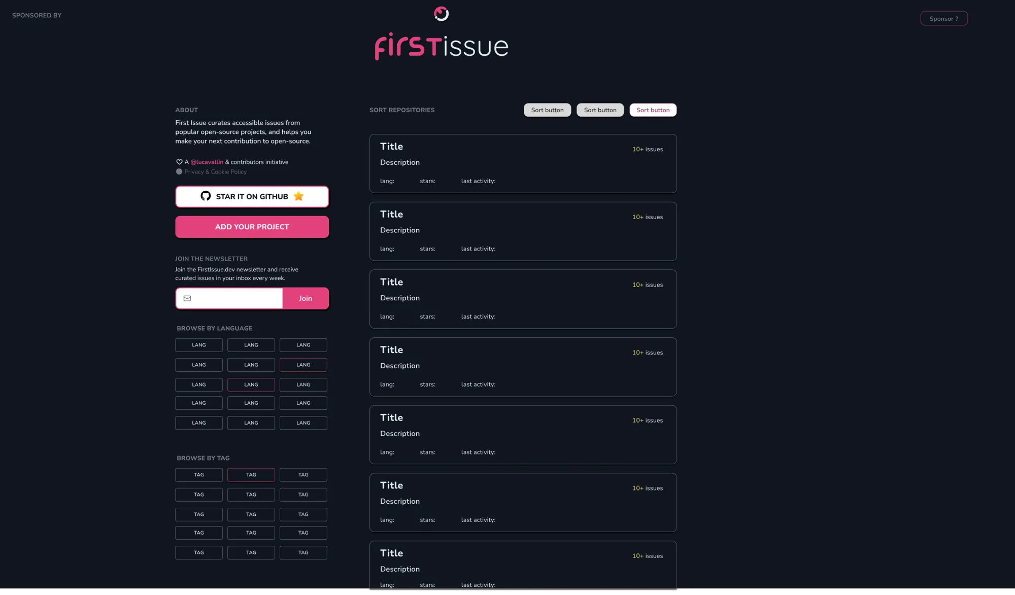
  • Two-column, central grid: filters left, repo list right
  • Tag and multi-select filter bar
  • Renamed to Verto.sh (the owner's call) with retro-arcade typography (Endless Boss Battle)

Bumps along the way

  • Long repo names wrapped to three lines; added truncation and a full-name tooltip
  • Initial filter colours had poor contrast on the green brand; changed to magenta and tested again

Some visuals of the work done

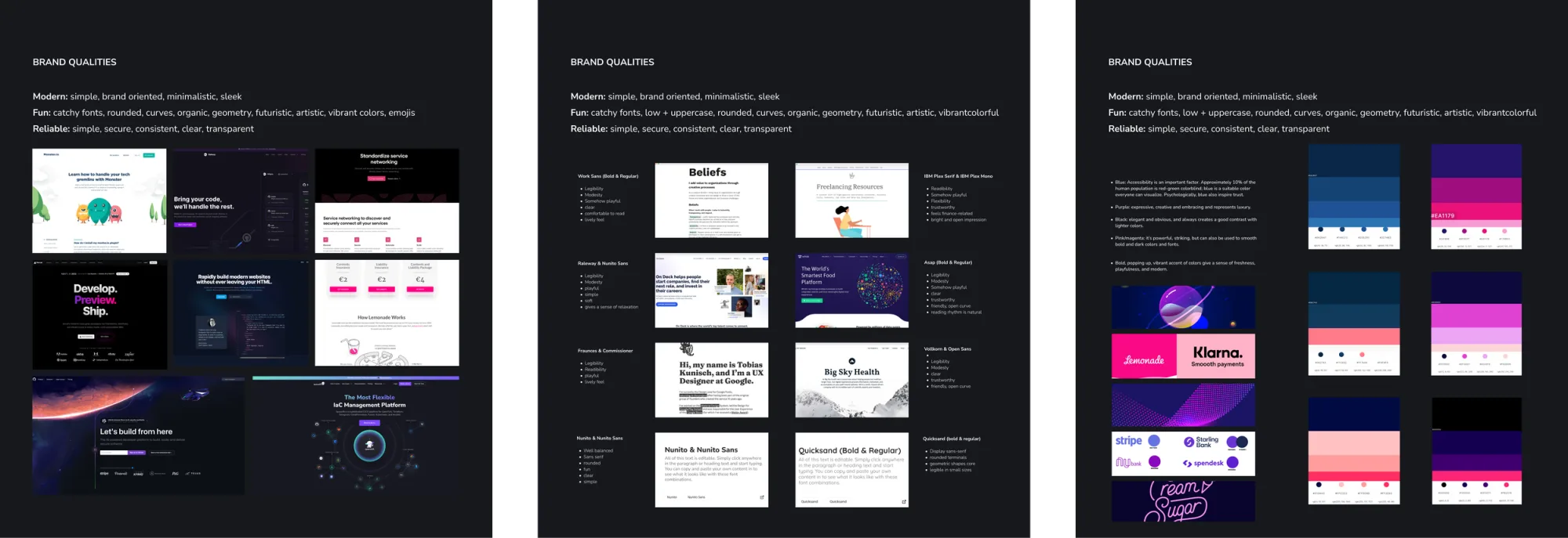
Three moodboard panels headed Brand qualities - modern, fun, reliable - collecting reference websites, typography pairings and colour directions.
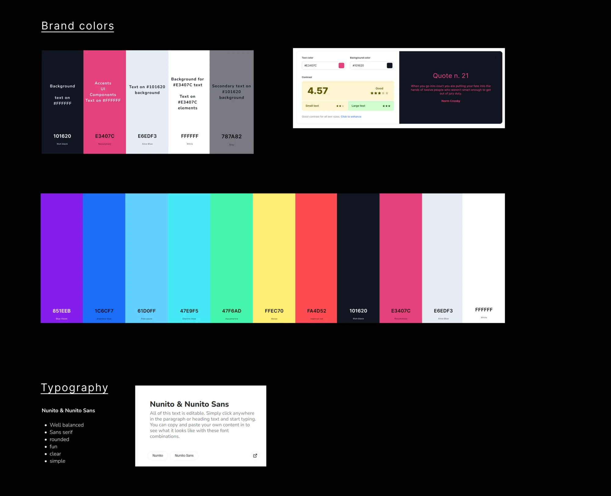
Brand colour board: the core palette with roles and hex values, a contrast check scoring 4.57, an extended eleven-colour palette, and the Nunito typography choice.
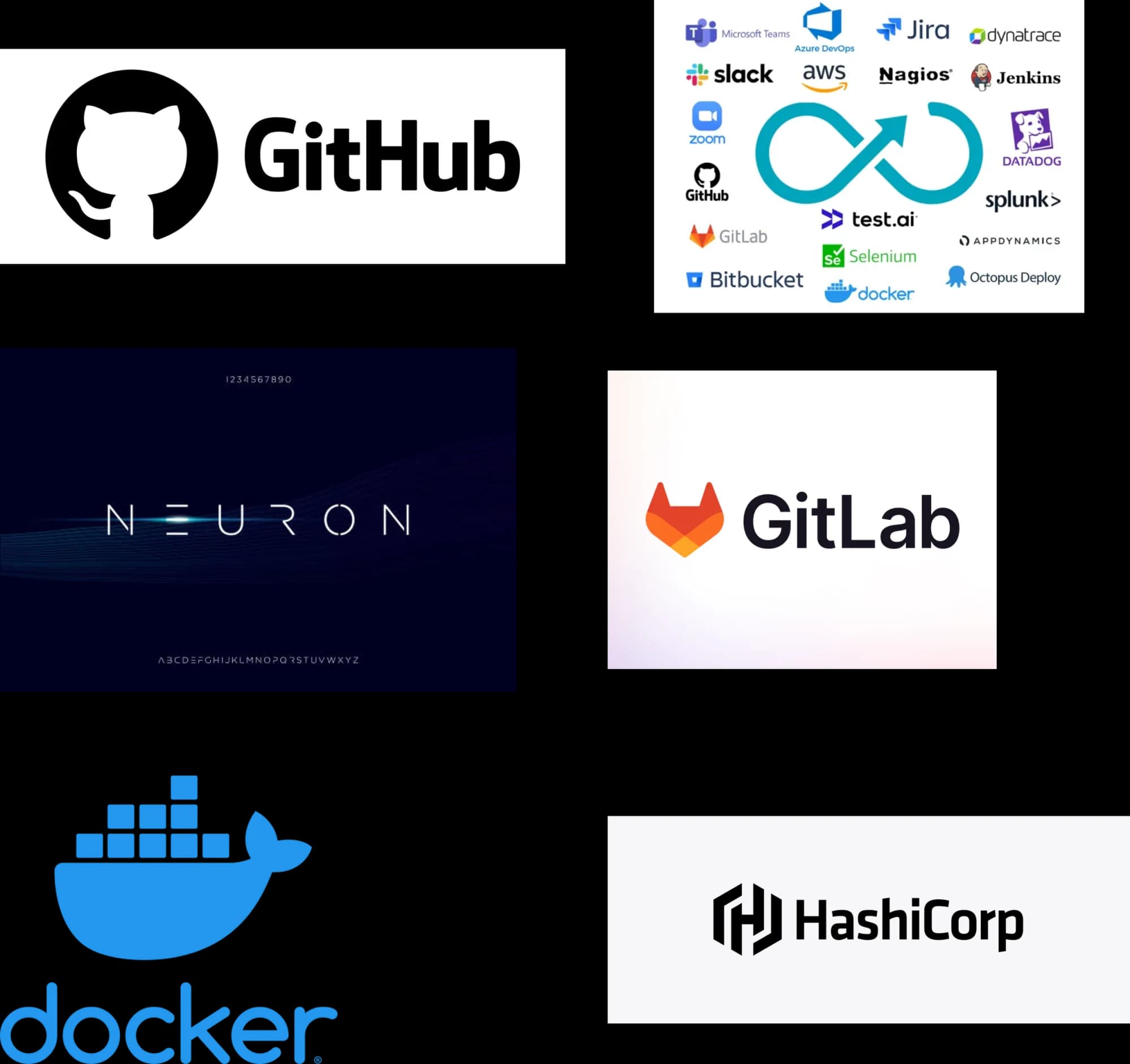
Visual research board of developer-tool branding - GitHub, GitLab, Docker, HashiCorp and a wall of DevOps logos - next to the Neuron display typeface.
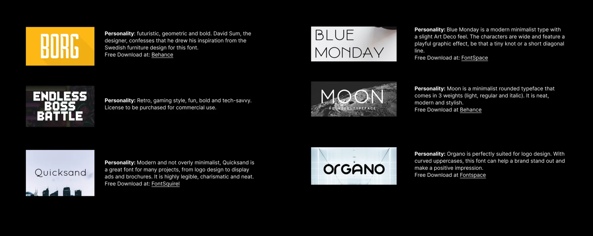
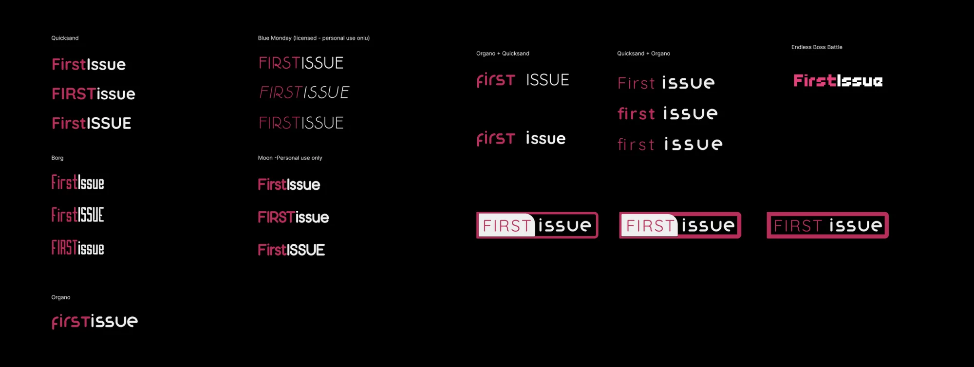
Typeface shortlist with personality notes for Borg, Endless Boss Battle, Quicksand, Blue Monday, Moon and Organo.
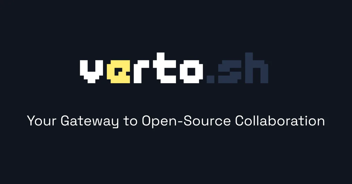
The Verto.sh pixel-art wordmark on a dark background with the tagline “Your Gateway to Open-Source Collaboration”.
The Verto.sh monogram: a pixel-art V and O in yellow and white on a dark navy square.

Leading the work

  • Started quickly by studying issue-tracker sites (CodeTriage, Up-For-Grabs, CodeSee) to find UI patterns that help newcomers make their first PR.
  • Kept the plan clear with a Trello board labeled "Today / Next / Someday" and held two 30-minute check-ins weekly with the solo developer to keep design and code aligned.
  • Tested prototypes live by sharing Figma links in GitHub Discussions. A dozen open-source contributors sent back feedback, which fed the last round of changes before launch.

Impact

What shipped & why it mattered

  • Complete brand refresh - new name (Verto.sh), neon-retro logo, and bright magenta-blue colors. Why it mattered: created a clear identity that appeals to both new and experienced developers and shaped the tone for all social media.
  • Two-column repo layout - repos listed on the right, filter shown on the left, no back-and-forth; new users find a suitable issue in about 30 seconds to 1 minute.
  • Filters for language, label, and difficulty - beginners focus on simple stuff, experts find harder tasks; 68% said it made issue finding easier.
  • Marketing features added - newsletter signup in footer and GitHub star button in header: gained 400+ new subscribers and a 25% rise in repo stars within two weeks.
  • Hacker News - the front-page spot doubled traffic while it lasted. Returning users stayed higher after the spike passed.

Reflection

The bright new neon logo caught attention, but what actually worked was the clarity: for users, and for code reviewers dealing with many wrongly tagged issues.

The main lesson: launch with just enough polish, then add UX details once real users come.

If I did it again, I'd test filters with real GitHub data from the start; fake data missed issues we fixed later.

The proof was watching both new and experienced developers filter down to an issue and open a PR without help.