Note: Due to confidentiality agreements, specific details about the platform and proprietary design elements cannot be shared.
Booking.com
Content Moderators Knowledge Base Redesign
- Role
- UX/UI Designer
- Timebound
- 4 months
- Tools
- Figma, Miro, Google surveys, online interviews, Maze, HotJar

The starting point
The knowledge base had hundreds of daily visits but was confusing: deep menus, a search showing outdated documents, and no clear layout. I faced three main questions:
- Where are moderators wasting time: scrolling, clicking, or bad searches?
- Could one design work for both beginners (needing guidance) and experts (wanting quick access)?
- How much could I match the brand style without breaking the current system?
How I turned issues into solutions
Gray areas
- "Search bar is impossible to find and shows irrelevant results first."
- Docs buried four levels deep
- Brand mismatch
- Irrelevant search results
What I did with it
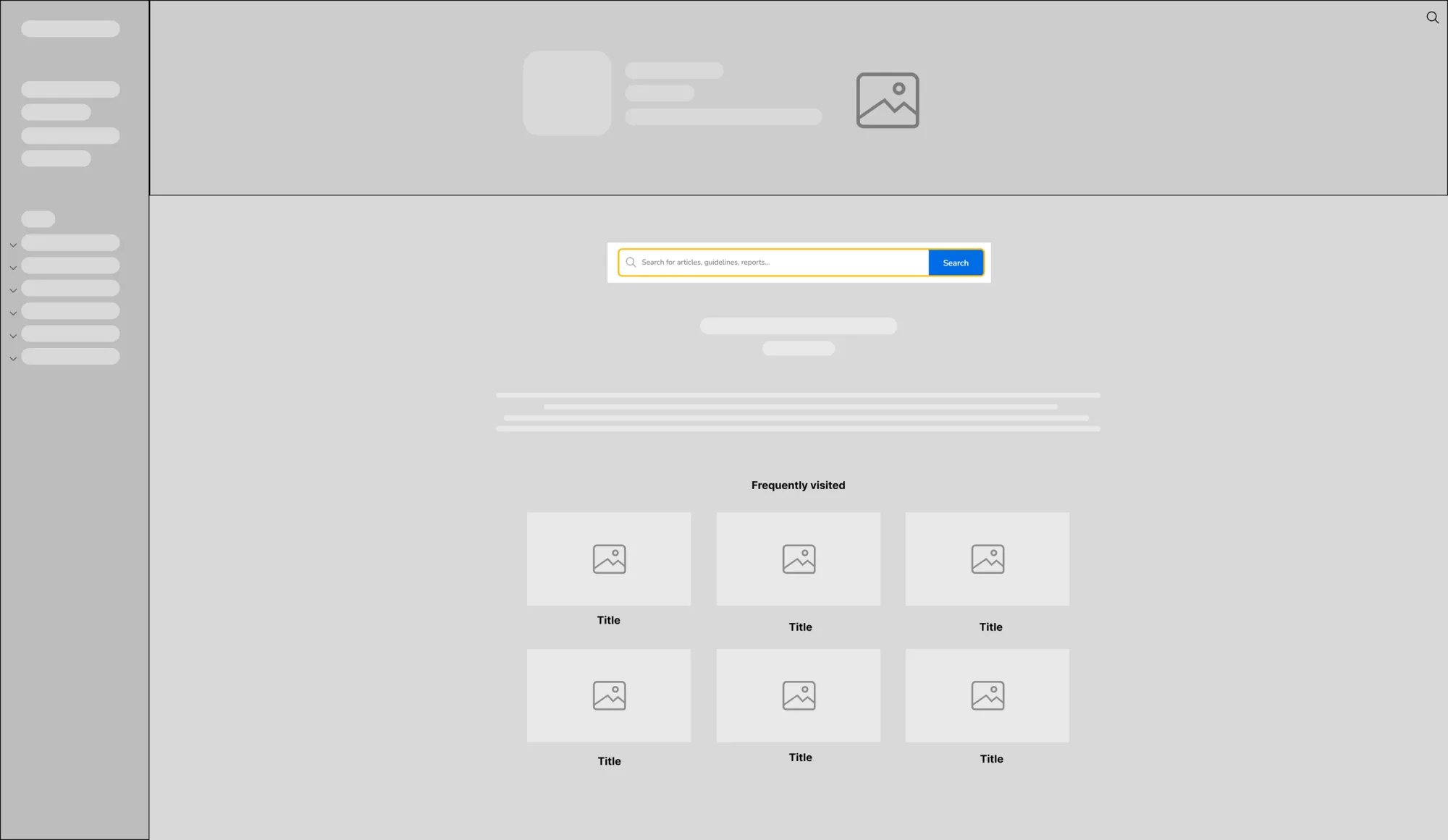
- Coded a simple HTML and CSS search bar that is easy to reach and matches Booking.com design system components.
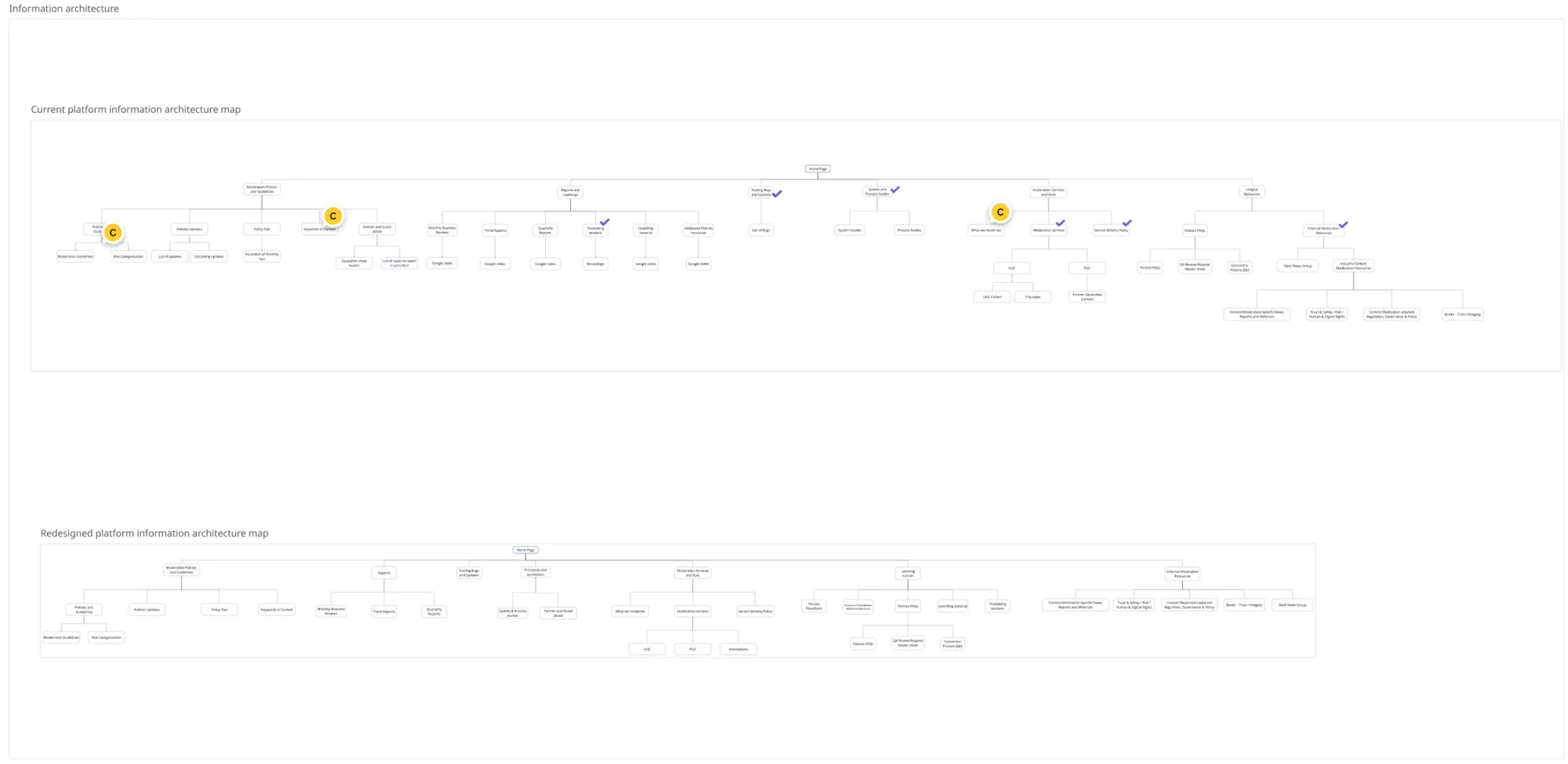
- Card-based landing page that puts the top tasks first; flattened the IA to two levels.
- Mapped typography, colour and iconography to the Booking design system and built a small dedicated design system for future use.
- Ran a search-log deep dive with data analysts to pinpoint the failing queries and find the cause of the irrelevant results.
Bumps along the way
- The knowledge base runs on sites.google.com, which is technically limited, so the search bar had to be embedded custom code.
- Top tasks were hard to identify, so I ran stakeholder interviews to work out which pages were visited most.
Some Booking.com design system elements (such as typography) could not be integrated in site.google.com - I created a similar and consistent typography scale for the site.
Some visuals of the work
Restructuring the information architecture
Improved search
Leading through the process
- Ran a search log deep-dive with data analysts to pinpoint the failing queries: most queries about one topic, "Confidential Data", failed because a specific word - "confidential" - was used in all the KB pages to indicate the confidentiality of the content, significantly reducing results accuracy. I replaced the text-based copy with an image so that it would not be detected during Search.
- Facilitated an IA workshop with Ops, TLs and PM that cut the depth of the menu.
- Studied and built an ad-hoc search bar from embedded HTML+CSS code to meet what users actually needed.
Impact
What shipped & why it matters
- Search bar returns the right doc on the first try 72% of the time vs. 30% before.
- Card landing, flattened IA, custom search bar cut average search time by ~60%.
- Brand-aligned UI boosted trust; internal survey satisfaction 4/5 on a 5-point scale.
Reflection
What seemed like a simple repaint project turned into detective work inside an old Google Sites setup. Every limit meant a compromise in code and scope: no component library, no real search API, strict typography.
Take-away
Google Sites fights branding: Rebuilding Booking's typography and colors from scratch taught me more about CSS specifics than any real design system work.
If I did it again
- Start prototyping with live legal text to spot search issues earlier.
- Include localization and accessibility checks in the first sprint, not just at final QA.
A knowledge base that answers correctly saves minutes every shift, and it brought moderators back to a tool they had written off.