


UX Hotels
@The UX Design Institute.
UX Research and Design of an hotel aggregator website from scratch.
The project involves collaborating with a fictitious hotel aggregator startup aiming to create an online experience that is fast, easy, and intuitive, rooted in a deep understanding of user needs.
Timebound: 6 months (part time)
Role: UX/UI Designer
Tools: Pen & Paper, Figma, SurveyMonkey, Miro, PowerPoint Presentation
The problem
Booking a hotel room online should be a simple process but, sometimes, it can feel complex. It is crucial for a startup to begin their business journey with the right setup.
Design Goals
Speed: Ensure the booking process is quick and efficient.
Ease of Use: Design intuitive navigation and clear, concise interfaces.
User Understanding: Incorporate insights from thorough user research into the design.
Task:
Design a new website focusing on the hotel booking process: starting from the hotel search all the way to the payment page.
Technical requirements:
medium fidelity, clickable prototype
detailed set of wireframes
My approach
-
Objective
Explore and review four competitor websites to understand how they present information.
Key Findings
Search Bar:
Smart, intuitive, icons
Calendars require multiple clicks
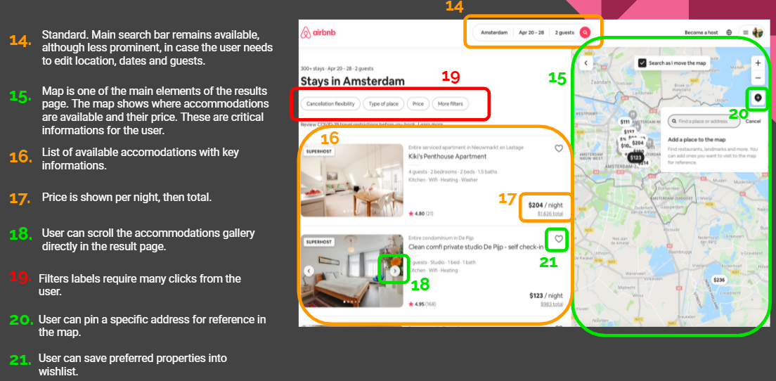
Results Page:
Froze-in-page search bar for easy edits.
Results are presented in a list
Filters displayed upfront or via a button.
Hotel Page:
Dominant visuals and images.
Key features: maps and reviews.
Display total price per stay, not per night.
Conclusion
Competitors' booking processes are similar, necessitating additional research methods to uncover areas for improvement.
-
Objectives
Identify user goals and behaviors when booking hotels.
Pinpoint pain points and desired features.
Understand usage context, including devices and environments.
Methodology
Online Survey
Audience: Regular hotel booking website users.
Sample Size: 31 respondents.
Format: Nine mixed-format questions on a single page.
Usability Tests
Conducted three tests with Expedia and Airbnb via Zoom.
Observed and recorded user interactions, pain points, and preferences.
Key Findings
Survey Results:
Top Factors: Location, Reviews, Price.
User Preferences: 65% prefer Booking.com for its user-friendly interface.
Pain Points: Stressful marketing pop-ups.
Desired Features: More filters, payment flexibility.
Price Sensitivity: 35% prioritize lowest price.
Usability Test Insights:
Context: Various environments and devices.
Behavior: Need for clear guidance and simplicity.
Pain Points: Navigation difficulties, overwhelming information.
Preferred Features: Intuitive interfaces, quick access to key info.
Conclusion
Integrating survey and usability test insights provided a clear understanding of user needs, guiding design decisions for a user-centric booking platform.
-
Objectives
Define the problem using research data.
Identify patterns and structure findings.
Methodology
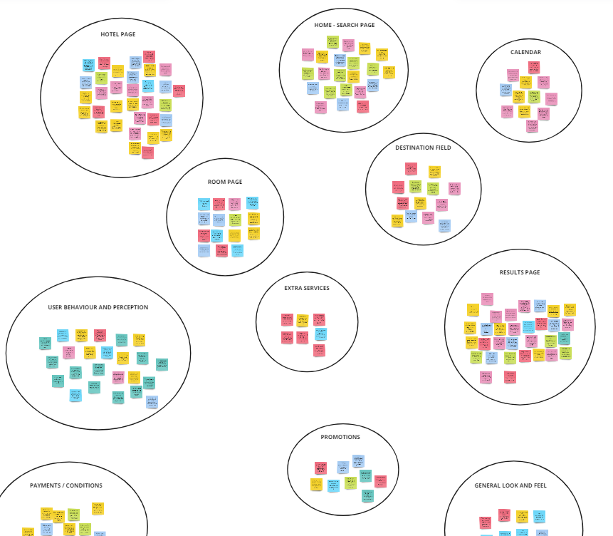
Affinity Diagram (open Miro)
Review and structure qualitative data.
Highlight patterns and key issues.
Gain diverse perspectives from a collaborative session.
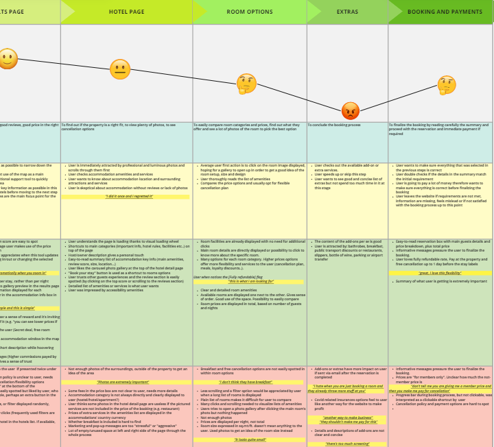
Customer Journey Map (open Miro)
Define steps, goals, and behaviors.
Identify pain points and positive interactions.
Visualize user emotions and experience.
Key Findings:
"Search" and "Room options" pages need improvement.
Users value clear visuals and images.
"Add-Ons" stage is confusing with unclear pricing.
"Booking and Payment" page causes uncertainty and average emotions.
-
Objectives
Address identified friction points and enhance user experience.
Utilize insights from affinity diagram and customer journey map.
Methods
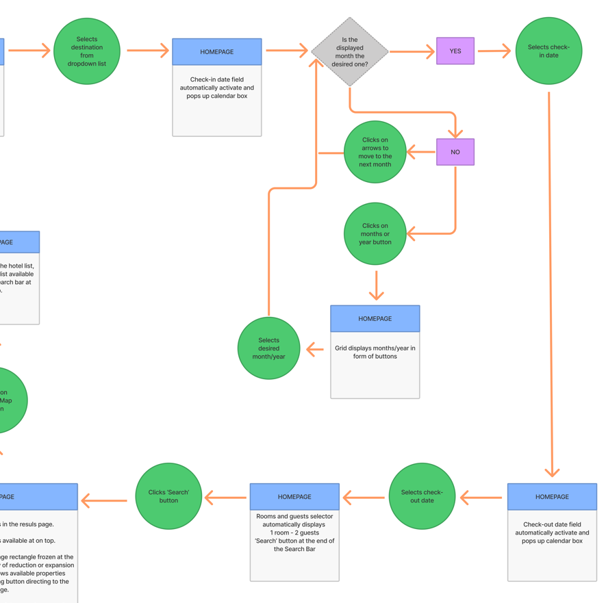
Flow Diagram (open PDF)
Purpose: Define high-level booking flow.
Process: Started with sketches to map user journey from homepage to payment.
Iterations: Refined paths based on user journey insights.
Interaction Design (Open PDF)
Purpose: Sketch screens and states based on flow diagram.
Approach: Used pen and paper for rapid iteration.
Considerations: Integrated user goals and research findings into detailed designs.
Design Solutions
Homepage: Clear search bar and intuitive date picker.
Results Page: Interactive map and streamlined loading feedback.
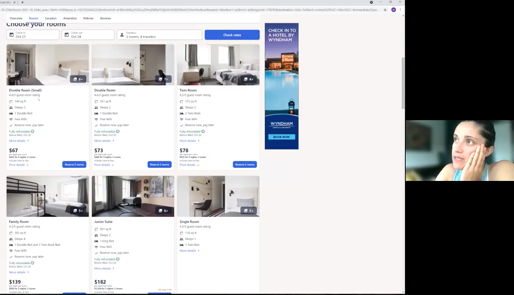
Hotel Page: Interactive map showing nearby attractions and grid view for room comparison.
Check-out Process: Step-by-step status bar, simplified add-ons selection, and clear booking summary.
-
Objectives
Create a medium-fidelity prototype to test flow, layouts, and interactions.
Iterate based on user feedback for enhancements.
Key Improvements
Map Icon Visibility
Increased size for better visibility.
Date Picker Enhancement
Replaced dropdown with clickable button for easier selection.
Add-Ons Description
Simplified and clarified descriptions, shown on hover.
User Feedback
Users liked the mid-sized map on the Results page.
Positive reception to changing and comparing cancellation/payment options.
Prototype Details (open Figma)
Booking Scenario: Oslo, Norway, 15-19 October 2022 with Airport Pick-up/Drop-off.
Interactions: Interactive elements throughout from search to payment.
Challenges/self-reflection:
Developing this prototype was a learning experience, emphasizing detail and usability in design using tools like Figma.
-
Annotations for Handover Documentation (open in Figma)
Objectives
Create detailed wireframes with rules, controls, and feedback for each screen in the hotel booking process.
Ensure developers have clear instructions to accurately implement the design.
Process
Generated comprehensive wireframes post-research, analysis, and design phases to guide development.
Key Points
Clarity: Precise annotations for each screen state.
Detail: Ensured all design elements were clearly defined for implementation.
Reflection
This process emphasized the collaborative nature of UX design and the critical role of clear documentation in facilitating seamless development.
A carousel of used methodologies
-
![]()
Competitive Benchmark
-
![]()
Survery
-
![]()
Usability Testing
-
![]()
Affinity Diagram
-
![]()
Customer Journey Map
-
![]()
User Flow
-
![]()
Sketches
-
![]()
Mid-Fidelity Prototype


My Challenges
My Learnings
UX Hotels is my very-first UX case study.
Since this was an academic project, there are no real metrics or results to show. Instead, I will share what I've learned.
-
Embracing patience and trust in the UX design lifecycle proved pivotal. Each stage, from research to prototyping, contributed uniquely to the project's evolution.
-
A significant challenge was overcoming personal biases during problem-solving. Recognizing that my perspective isn't always representative of the target audience was crucial. This mindset shift enabled me to design with empathy, prioritizing user-centric solutions over personal preferences.
-
Conducting and moderating usability tests presented a steep learning curve. Initially daunting, practice sessions and self-recorded rehearsals bolstered my confidence. The process of observing user interactions and synthesizing feedback proved immensely rewarding, highlighting the iterative nature of UX design.