
Booking.com
Content guidelines and reporting
Redesigning Booking.com's Content Moderation Policy Pages
Link: Content Guidelines & Reporting
Timebound: 3 month
Role: UX/UI Designer
Tools: Figma
Context
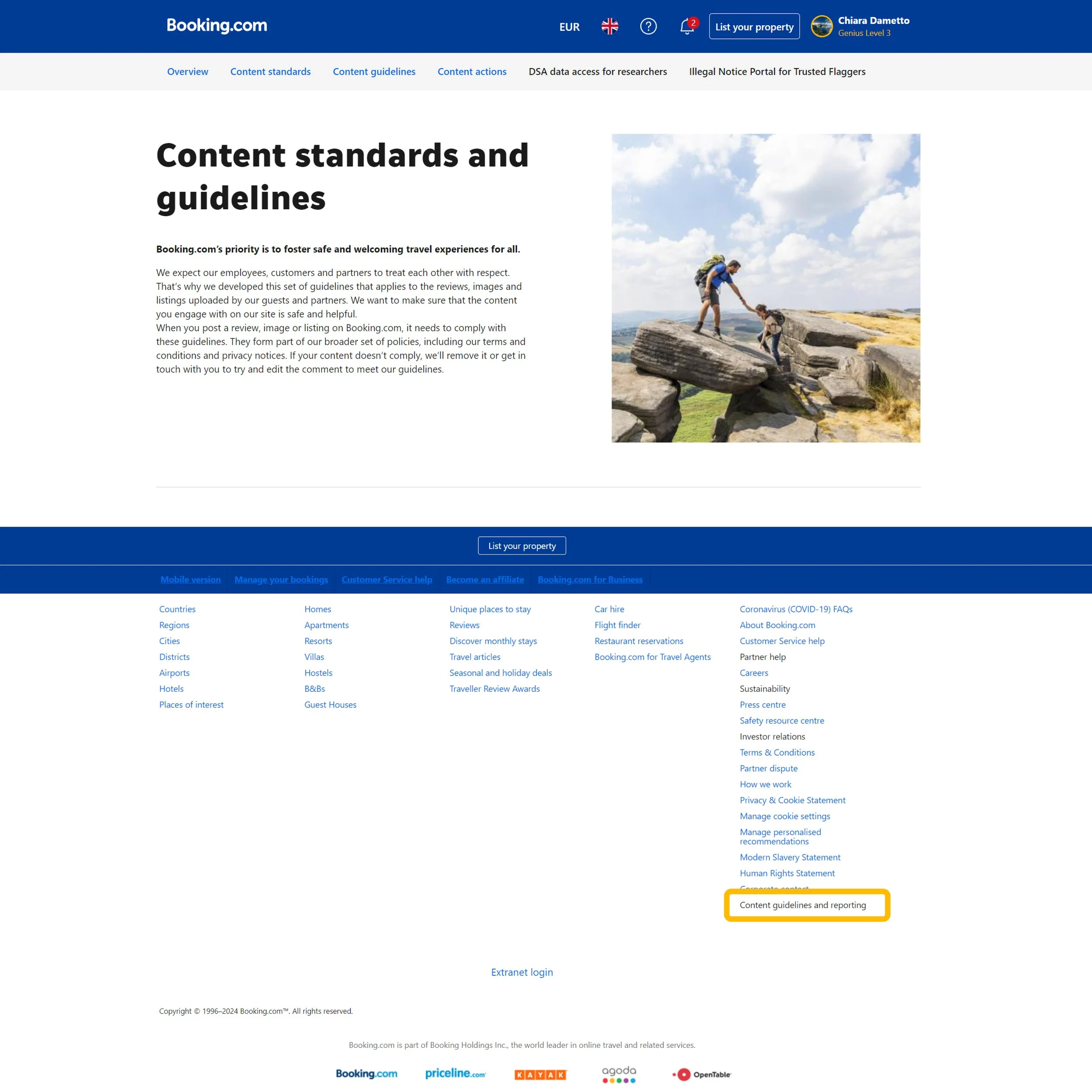
The Content Guidelines and reporting pages explain Booking.com's rules for moderating content, detailing how to ensure user-generated content is high quality and complies with standards. Users include partners, property owners, customers, employees, and regulators. They use it to understand and follow content standards on Booking.com's platform.
The problem
The content moderation policy pages on Booking.com lack unique branding and visual appeal. They have too much text and need to be adaptable for new sections, which could make navigation difficult.
Goals and solutions:
Brand personality: Inject more of Booking.com's brand personality into the pages. Create a clean and intuitive user interface for the Content guidelines and reporting user-facing pages.
Content Strategy: Reconsider the IA and navigation to ensure scalability.
User Experience: Improve interactivity and user experience by improving readability and engagement.
Compliance: Ensure that the design and content of the report meet all requirements of Booking.com’s Design system and branding.
My approach
-
Design System: I took time to learn Booking.com's Design System, Design Language, and branding rules.
Current State Analysis: I reviewed current pages to find branding gaps, information architecture problems, and design elements that need improvement.
-
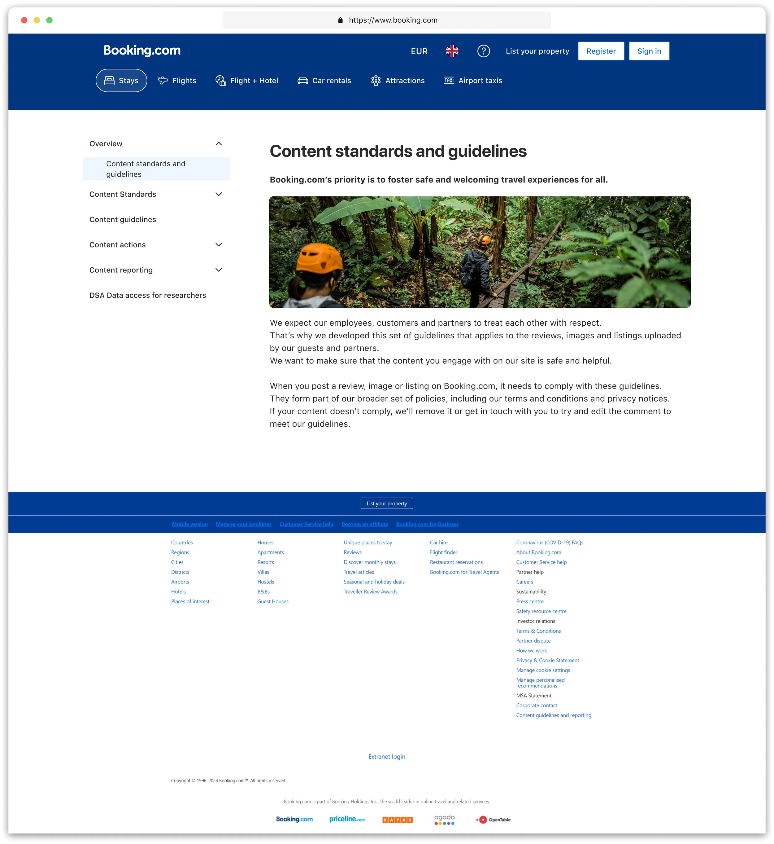
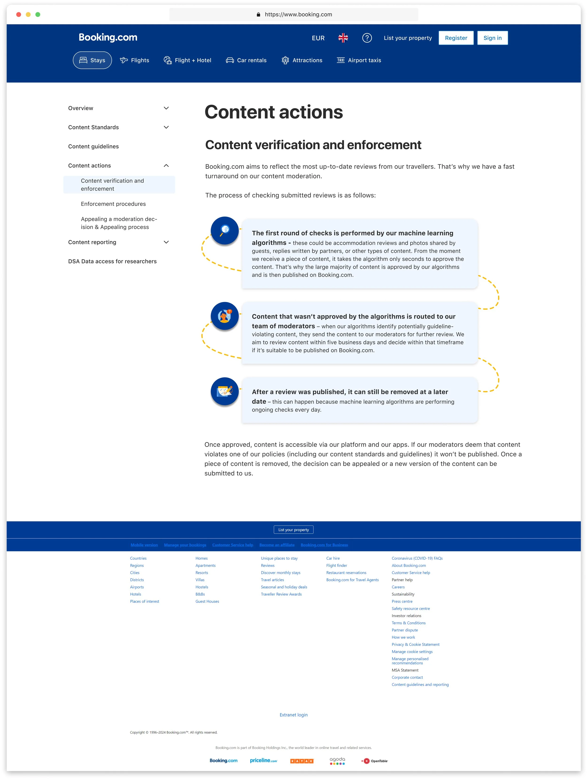
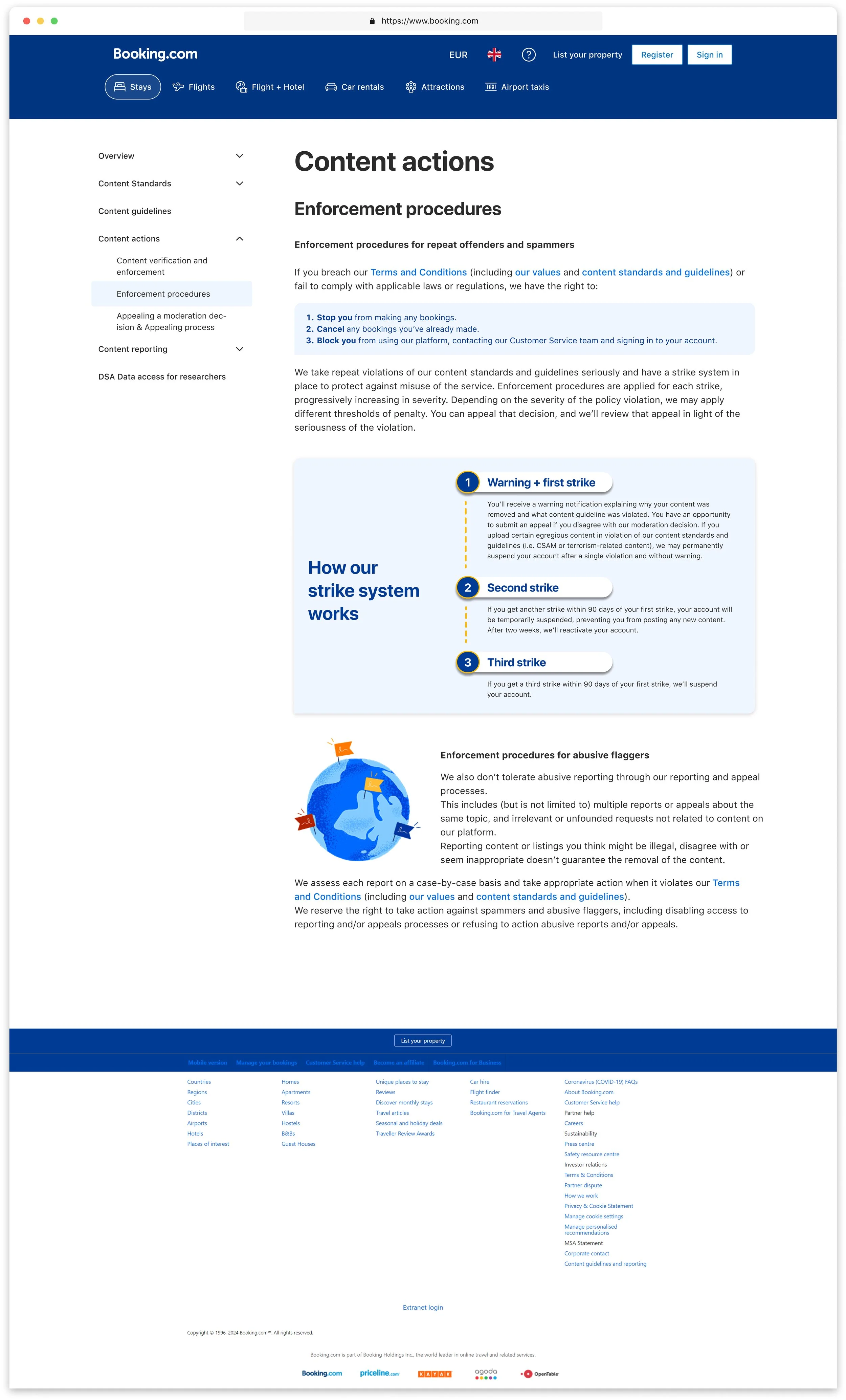
Navigation Redesign: Recognized that the current top navigation bar wouldn't support the expanded content. Implemented a cascading side menu component to better organize content into sections and subcategories.
Future-Proofing: Made the IA flexible to handle future expansions without compromising user experience.
Original navigation

Redesigned, extended navigation bar - Desktop
1st version

2nd and final version - following PM and developers collaboration


Redesigned, extended navigation bar - m.dot
1st version

-
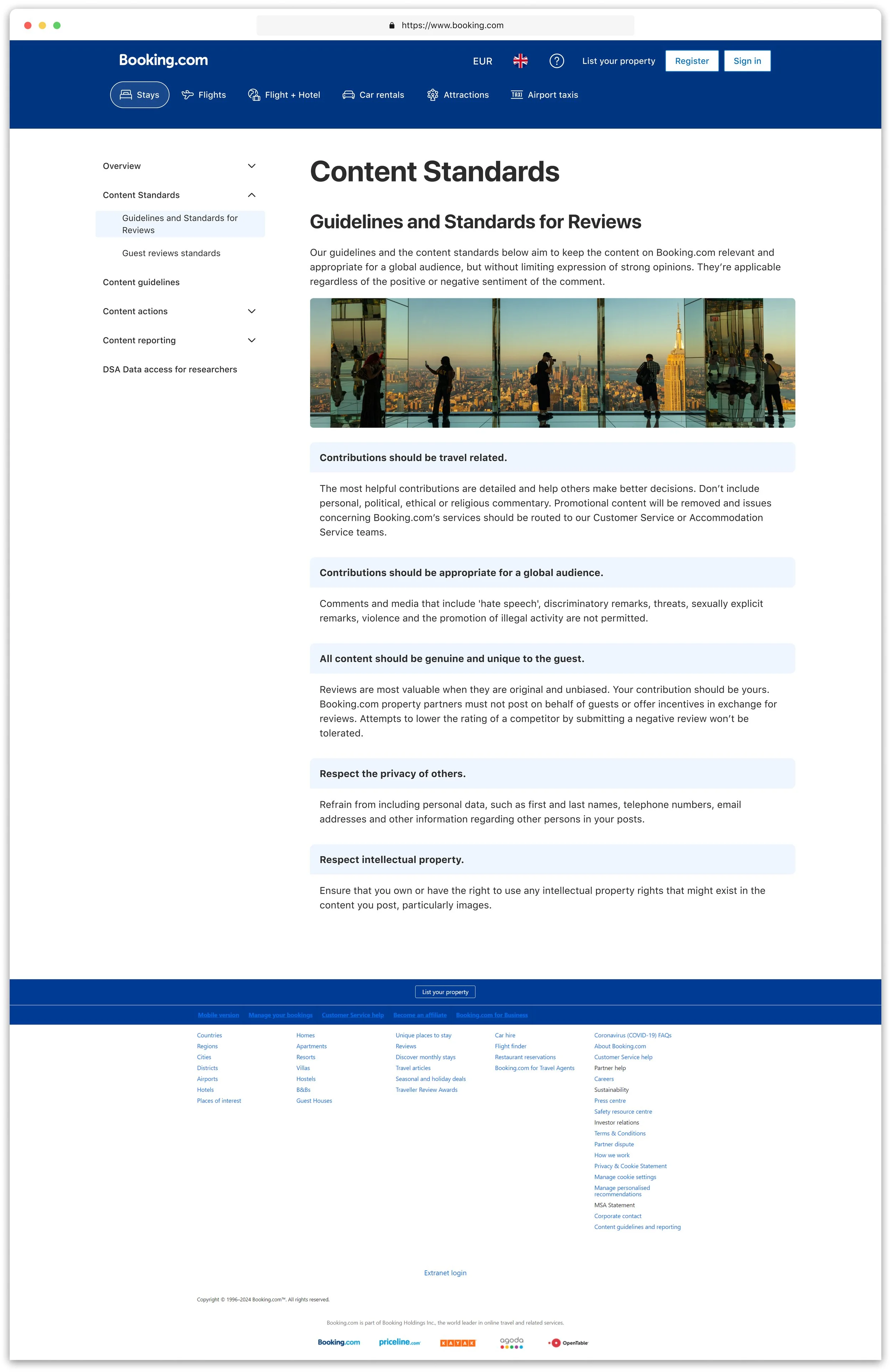
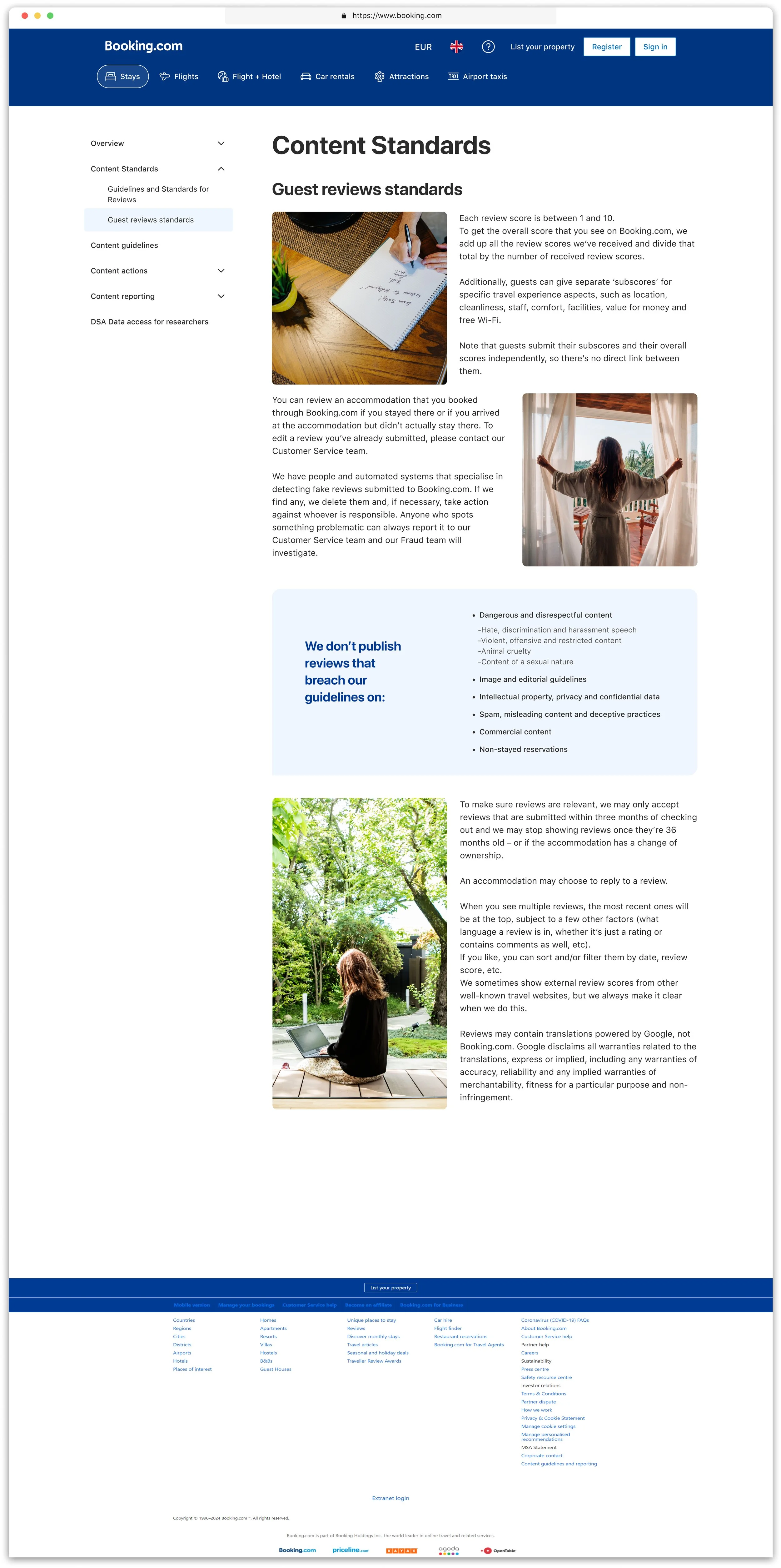
Consistency: Made sure all design parts matched Booking.com's branding rules for a uniform and professional appearance.
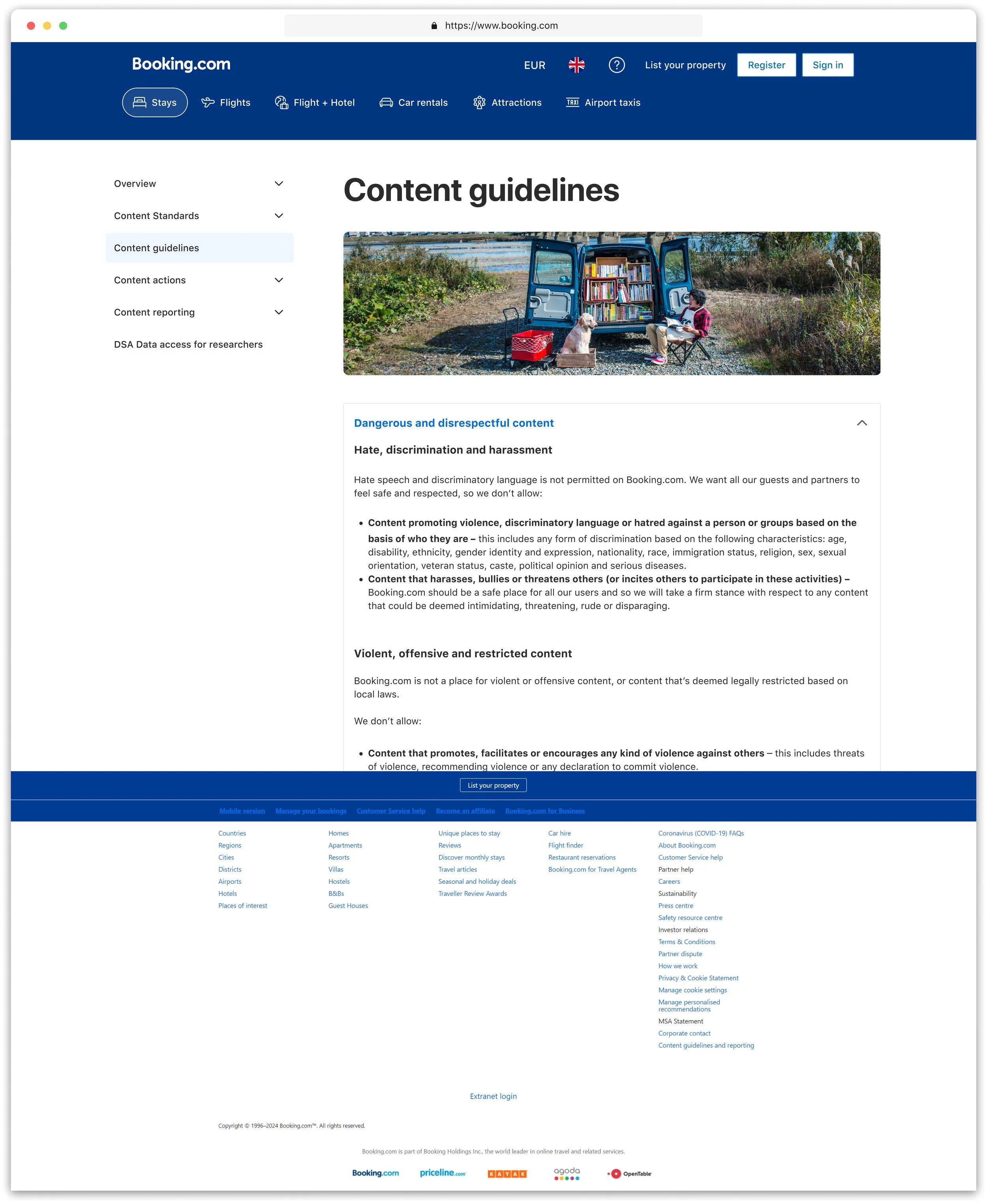
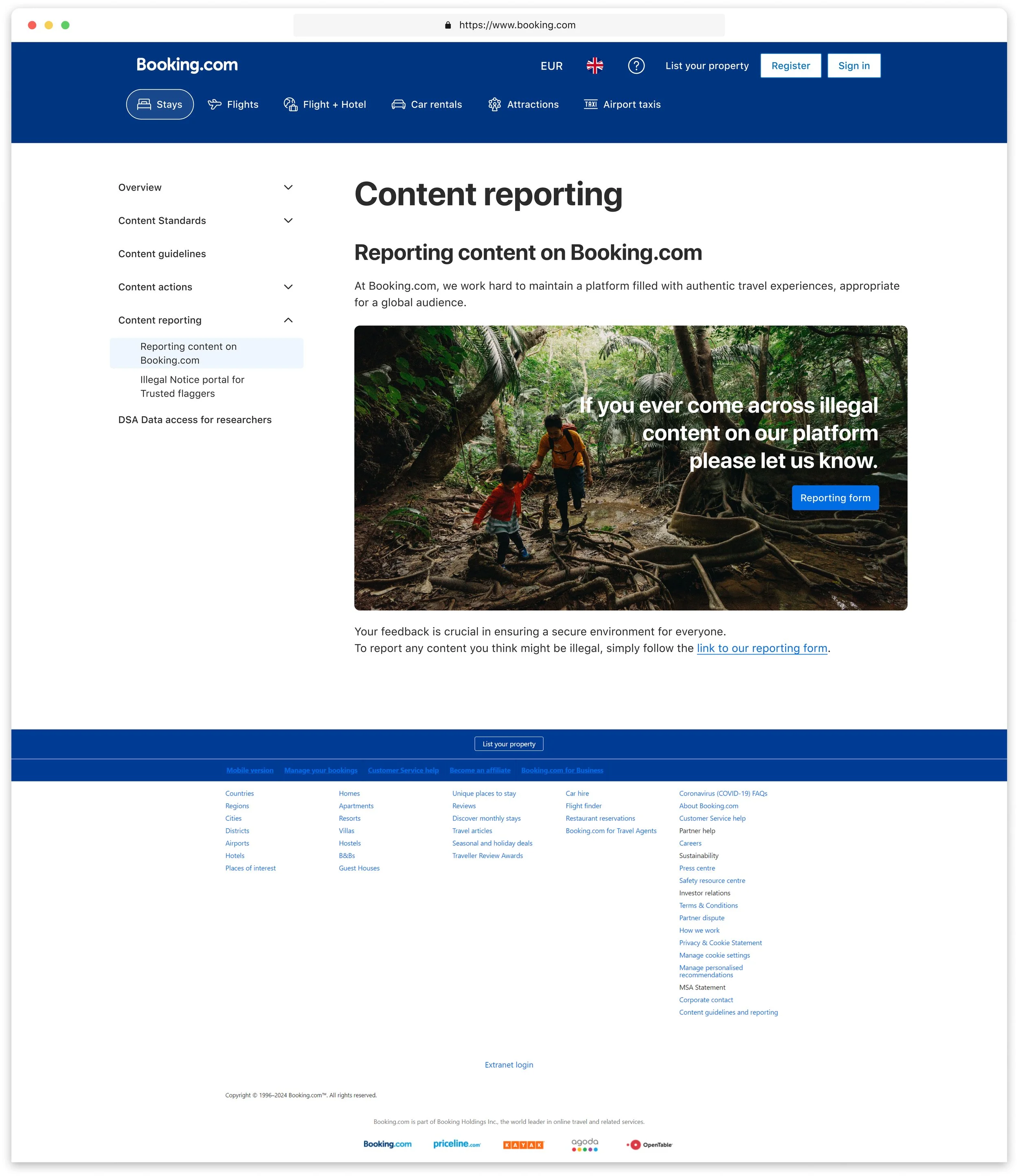
Visual Appeal: Included branding features like illustrations, icons, and brand colors to improve visual attractiveness and strengthen the brand presence.
Used Booking.com's design elements for interactive features
-
Applied gestalt principles of common region, continuity, proximity and similarity to strengthen branding familiarity.
Interactivity: Introduced interactive elements to balance out the text-heavy content and make the pages more engaging: carousels, photos that connect with the content of the page,
Content Distribution: Considered hierarchy of content, and layout. Broke down text into more digestible chunks, improving readability and user engagement.
-
Wireframes & Prototypes: Created wireframes to visualize the new design and gather feedback.
Iterative Feedback: Used iterative feedback from stakeholders and mentors to refine the designs and ensure they met expectations.
-
Throughout the project, I actively engaged with stakeholders to ensure alignment and clarify expectations.
I also reached out to experienced colleagues at Booking.com to gather their opinion and make sure my design would follow company's high standards.
Their insights were crucial in shaping the content strategy and ensuring accuracy.
This experience has not only strengthened my design skills but also highlighted the value of collaboration and continuous learning in achieving outstanding results.

I created a detailed walkthrough page in Figma with notes and specs for the developer, along with links to the company’s components, patterns, and images. During my design proposal presentation, we challenged each other to consider every detail, revealing some technical limitations. This led to renegotiating certain features with stakeholders and strengthened my relationship with the product manager and developers. Key takeaways include:
Navigation Bar Logic: Learning about product development from a developer’s viewpoint due to technical issues with the navigation bar.
Content Gaps: We hid some sections until the copy is ready to avoid showing empty pages to users.
User Experience: We kept external site links in the navigation bar to reduce unnecessary steps for users.
Visual Elements: My visual designs were accepted and needed new copy tags from the language specialists for scalability.
I made these updates within a day and submitted the document for development.
Working with the Product Manager and developer was my favorite part. It challenged me to think about the bigger picture in product development and I learned a lot from them.
Outcomes
-
The redesign improved the readability and made the content more engaging and easier to navigate, significantly improving user satisfaction.
-
The new IA and navigation structure are flexible and can easily accommodate future expansions
-
The redesigned pages now better reflect Booking.com's brand personality, creating a cohesive and professional look.
-
Rated 4/5 for alignment with standards.
-
The redesigned pages have been well received internally and will soon be published on the customer-facing website, demonstrating the success of the project.


Challenges & Learnings
This project was a rewarding experience that allowed me to blend creativity with practical UX/UI principles. The redesign not only improved the overall user experience but also ensured the pages are future-proof and aligned with Booking.com's brand identity. This case study showcases my ability to tackle complex design challenges and deliver solutions that meet both user needs and business objectives.
-
Challenge: Include Booking.com's brand style while keeping content-heavy pages functional.
Solution: Chose bright colors and modern fonts that match the brand but still support readability and usability. -
Challenge: The top navigation bar couldn't grow and didn’t work well on mobile.
Solution: Added a side menu to organize content better, allowing for future growth and ensuring the full menu is visible on mobile when expanded. -
Challenge: The pages had too much text, making them hard to navigate and engage with.
Solution: Simplified the text into smaller sections and added interactive features to boost user engagement. -
Challenge: Meeting client expectations with tight deadlines.
Solution: Regularly gathered feedback from stakeholders to improve the designs quickly.
Challenges I faced
Learning moments
-
Learning: Setting up design pages and documents from the beginning is crucial for a smooth workflow.
Application: Prioritized organizing all design elements and documentation early in the project, making it easier to manage updates and collaborate effectively.
-
Learning: Future-proofing the IA and navigation structure is crucial for accommodating content expansion without compromising user experience.
Application: Designed a flexible IA that can easily handle additional sections and pages, ensuring long-term usability.
-
Learning: Prioritizing user needs and feedback leads to more effective and satisfying design solutions.
Application: Conducted user research and gathered feedback throughout the design process, ensuring the final product met user expectations.
-
Learning: Successfully integrating brand elements enhances the overall user experience and reinforces brand identity.
Application: Consistently applied Booking.com's design system and branding principles to create a cohesive and professional look.
-
Learning: Effective communication and collaboration with stakeholders are essential for project success.
Application: Maintained open lines of communication with stakeholders, ensuring their input was considered and incorporated throughout the redesign process.